OVERVIEW
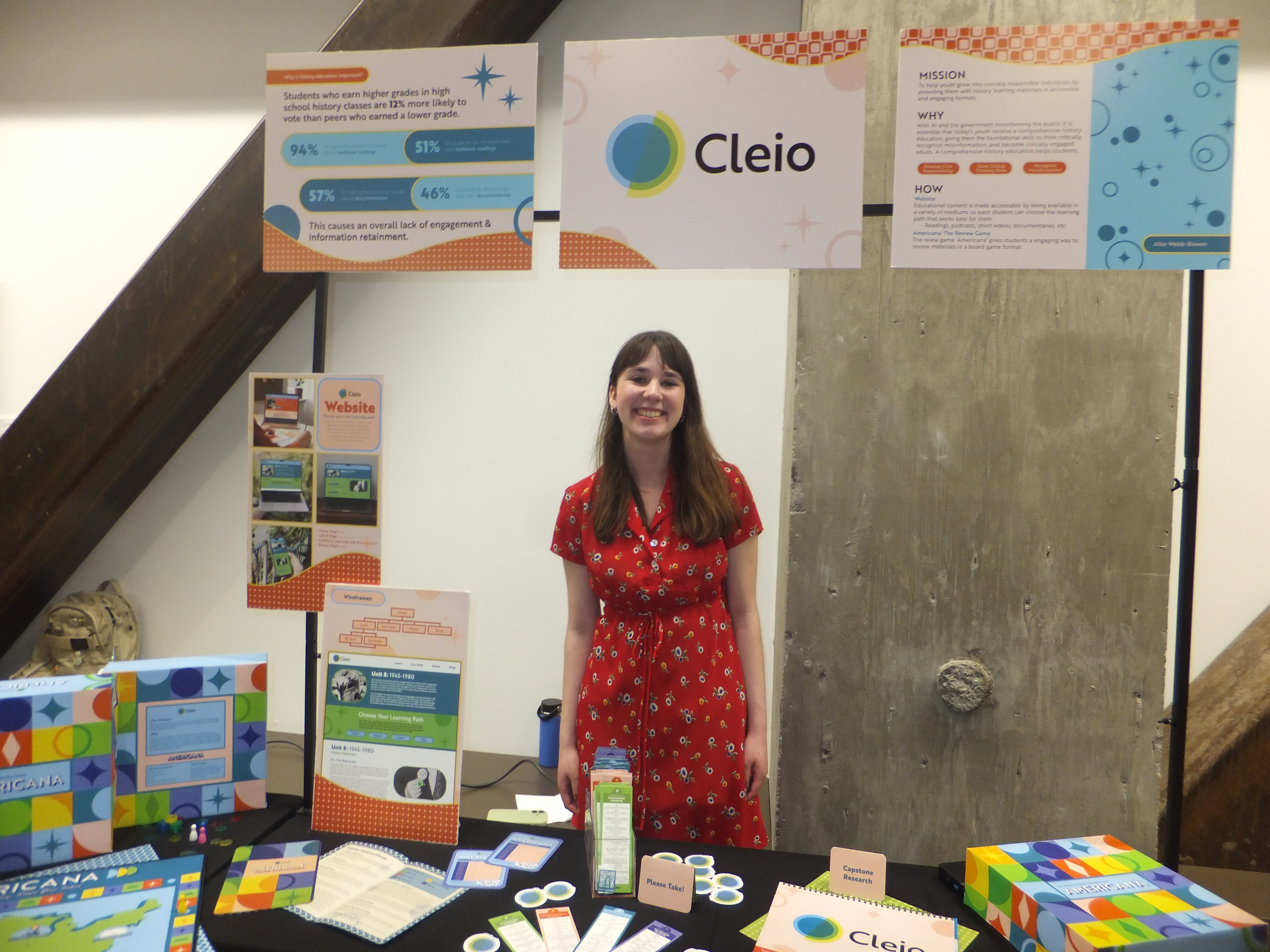
In my senior year of college in order to graduate I needed to complete my senior Capstone project. We were given full creative liberties over what we would spend the last two terms of college creating, the only requirement being that our project solved a real world issue.
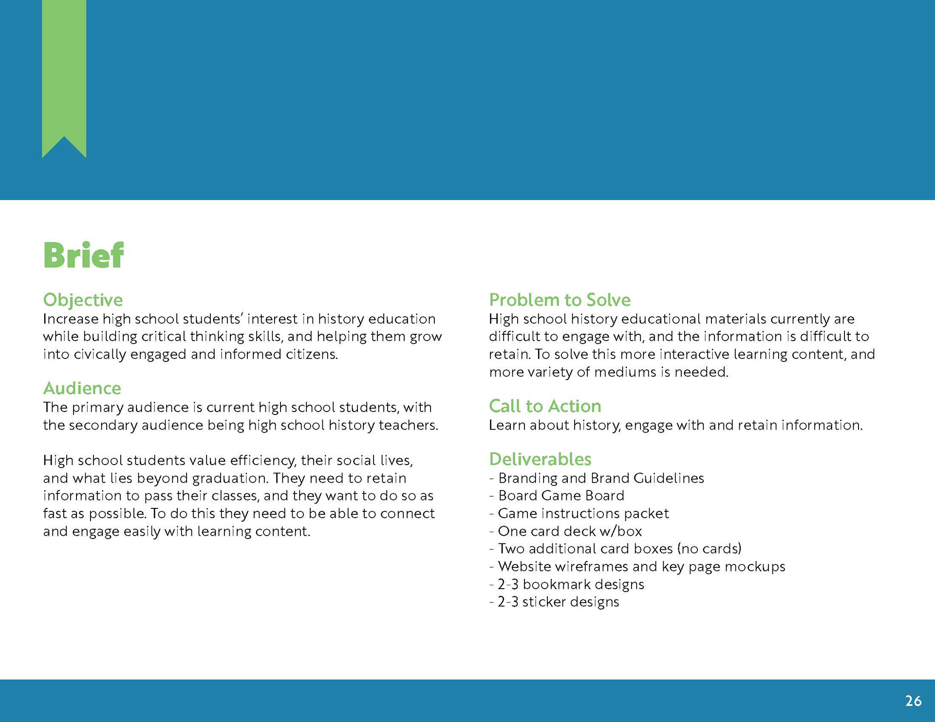
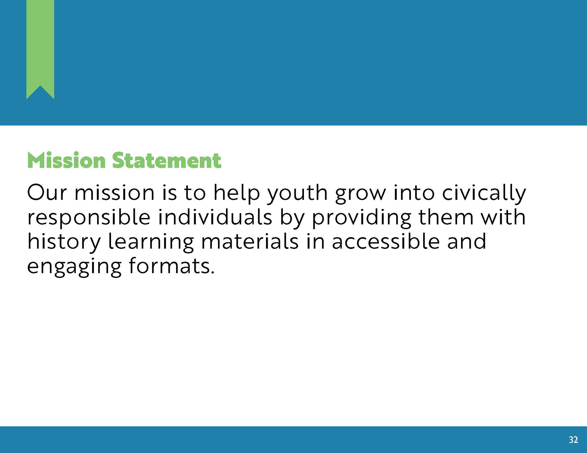
After months of research and designing Cleio was born with the purpose of answering one question, How can I design history educational materials that engage high schoolers, build critical thinking skills, and create pathways for learning about current and past events. Ultimately I created a branding system, board game and website mockups to encompass the brand in its entirety.
Programs Utilized: Adobe Illustrator, InDesign & Photoshop
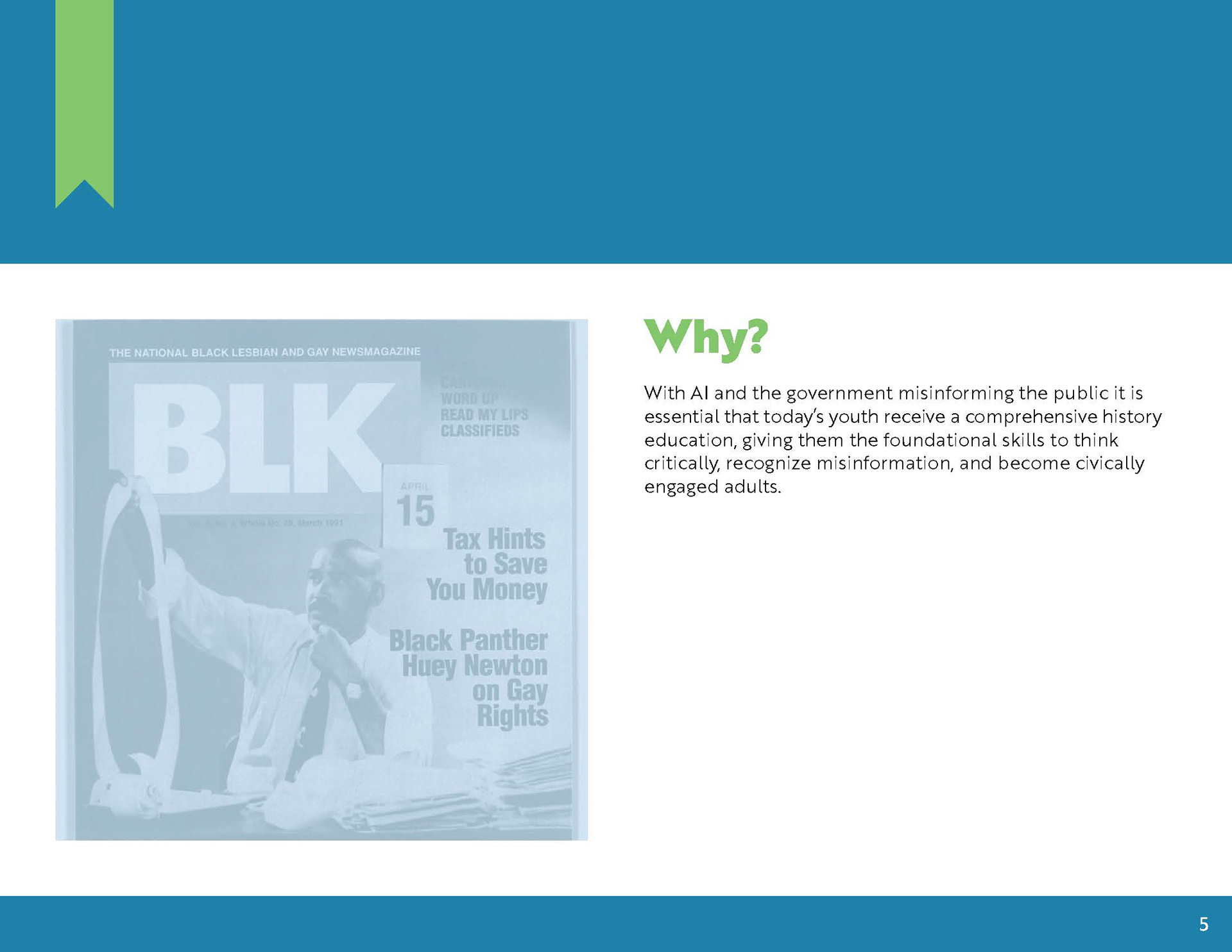
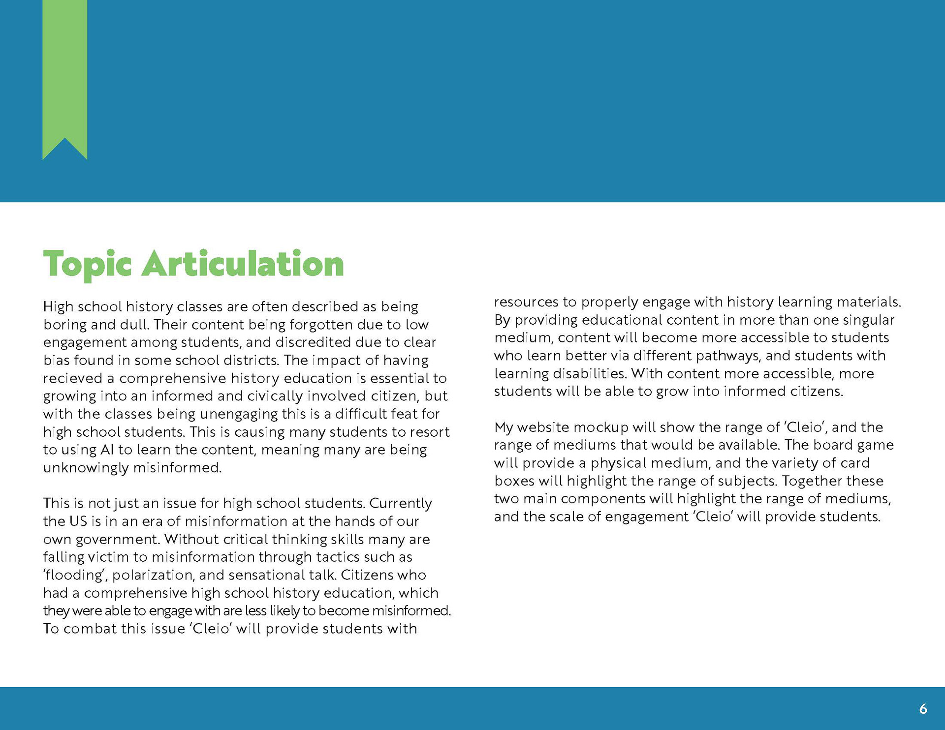
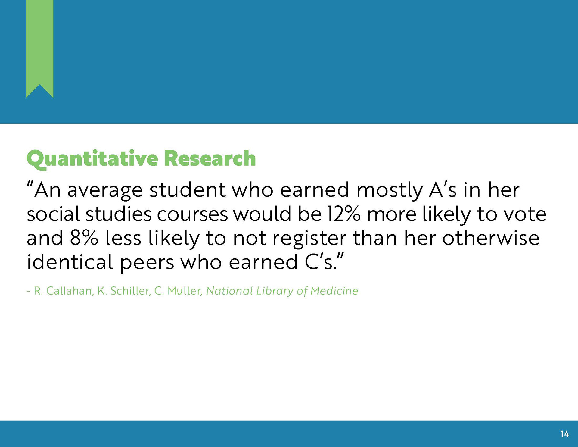
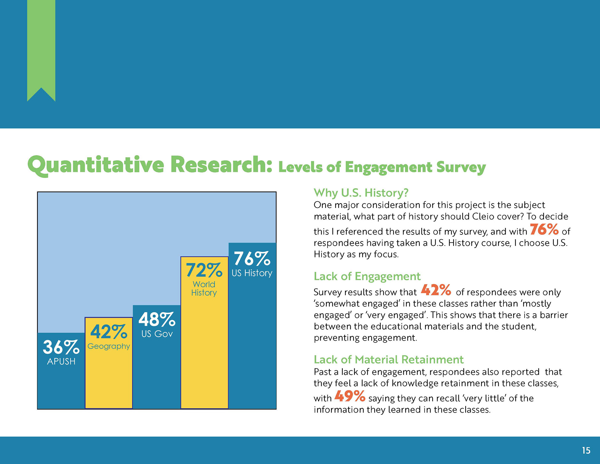
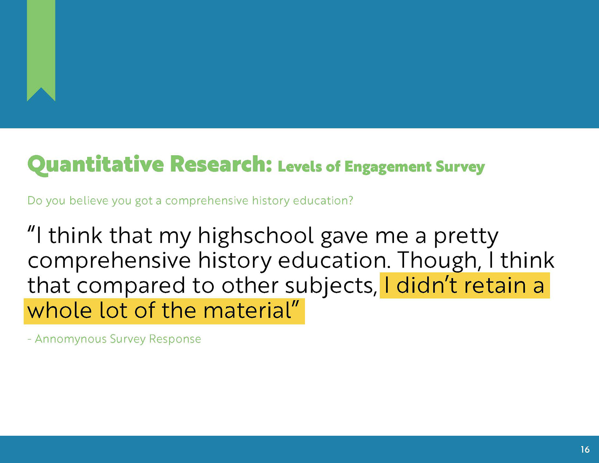
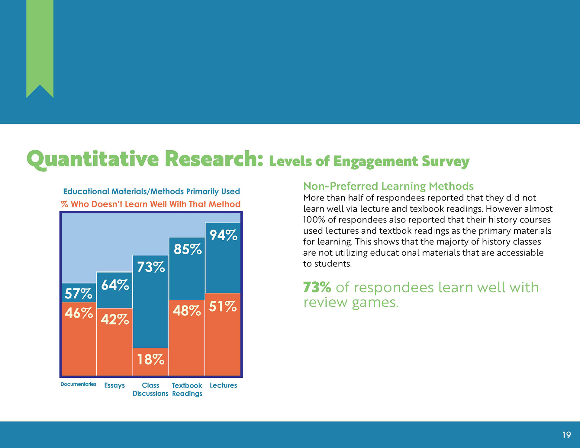
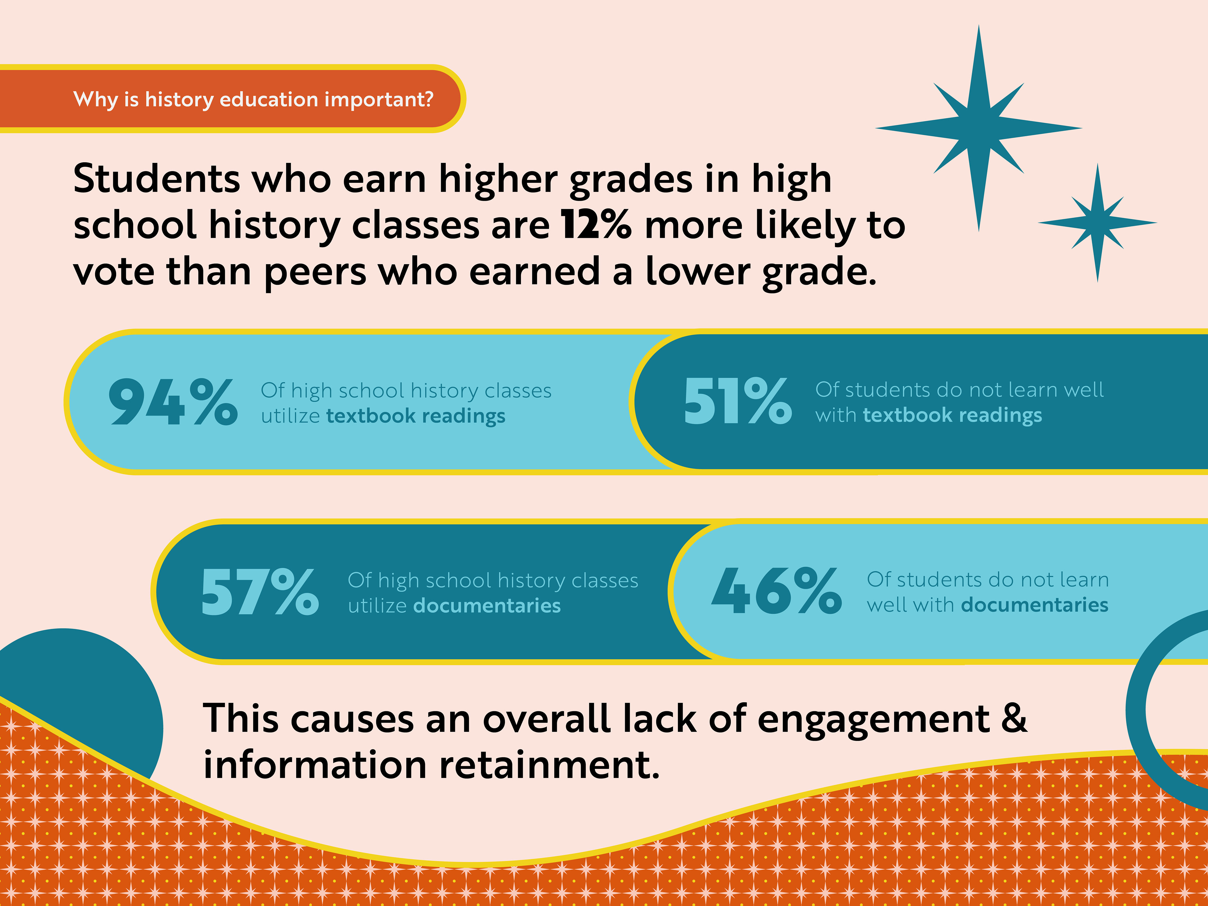
WHY DO I CARE? History education is important to me as I believe it is essential in out current political climate that everyone remains well informed, has the skillset to recognize misinformation, thinks critically and engages civically. It is proven that a high school student who earns a higher grade in their history and social studies courses are more likely to register to vote, and develop key skills that will help them succeed in the future. However many students report that they do not learn well with the current materials used in history classes. Cleio addresses this issue.
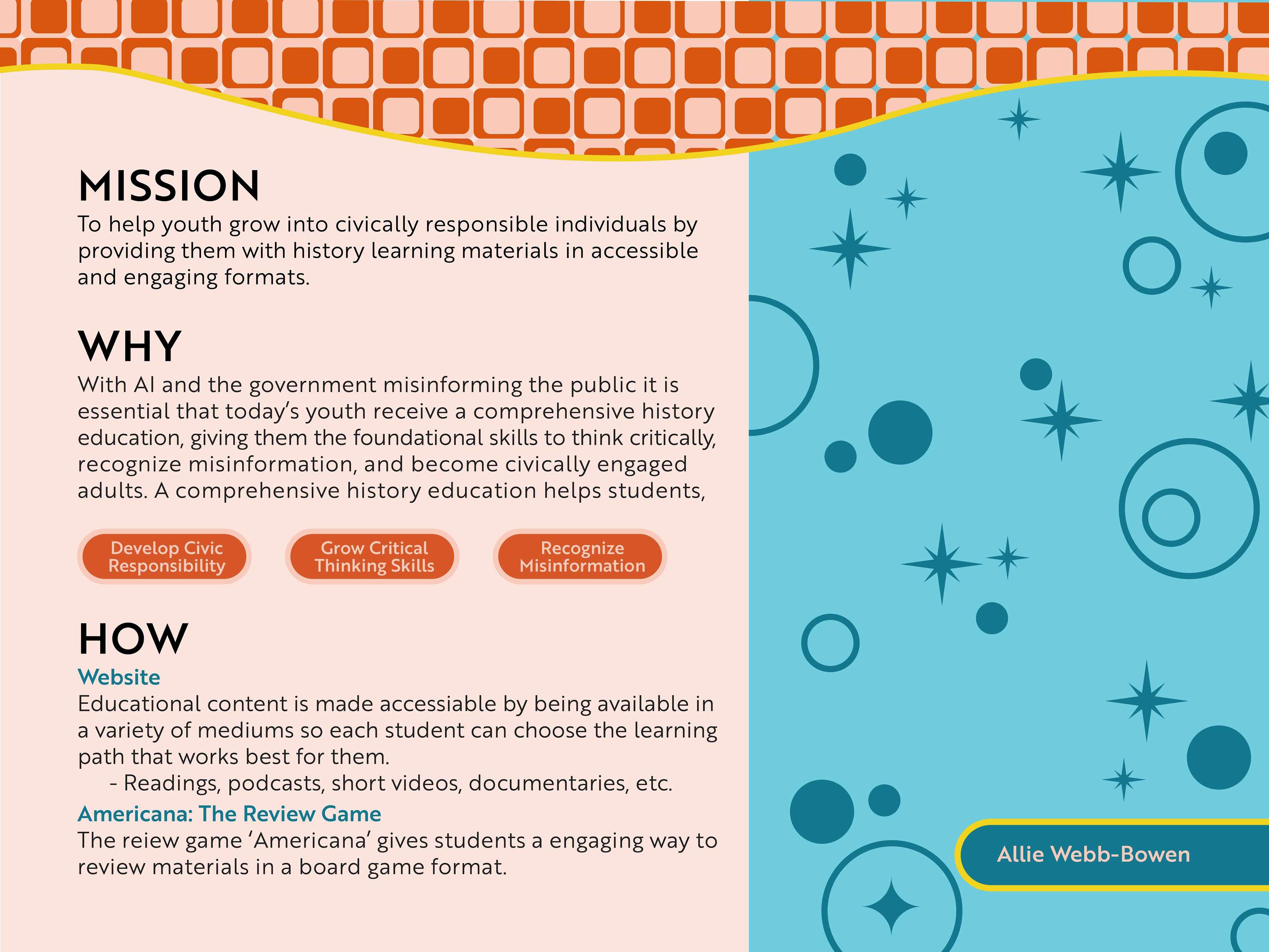
So what does Cleio do? Cleio offers all APUSH History materials in a variety of learning formats. This gives students control and agency over how they learn. This allows them to learn history and gain the skillset they need to grow into civically engaged adults.
BRANDING
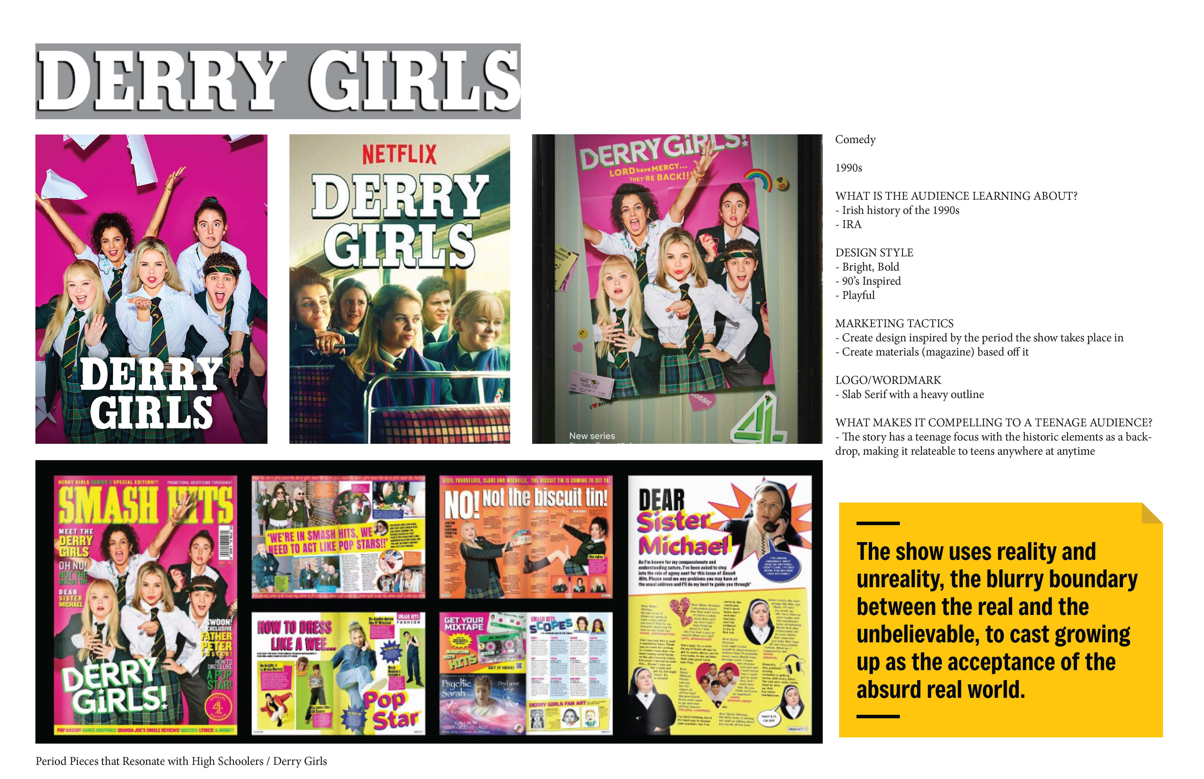
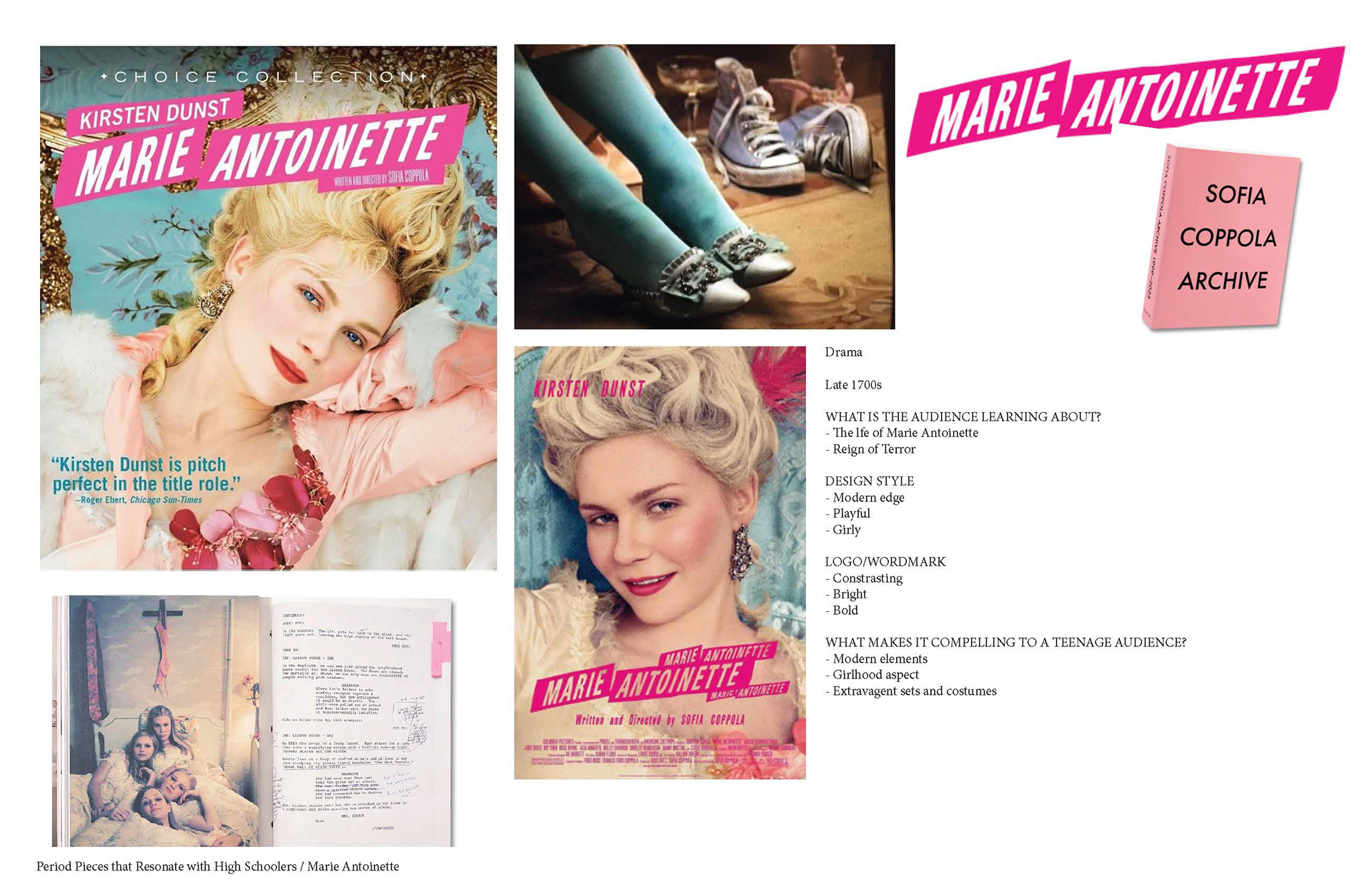
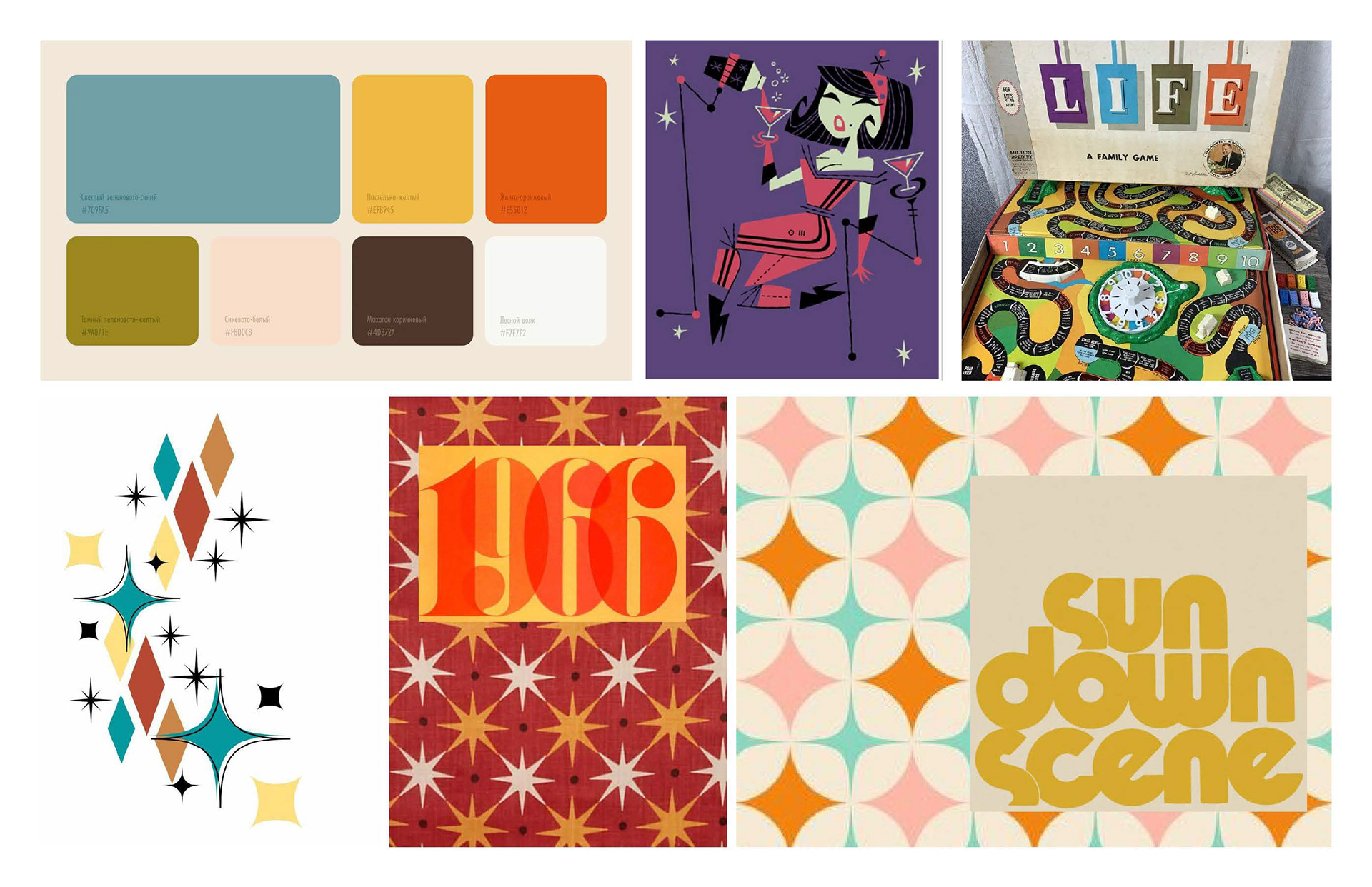
Through my research for this project I came to the conclusion that when teenagers (the target audience) connect to media that is teaching them history without it feeling like a learning resource, the media must be nostalgic to the specific era. For example, the television show Derry Girls emerses you in the 1990s through its design choices, which better allows youth to connect with the content.
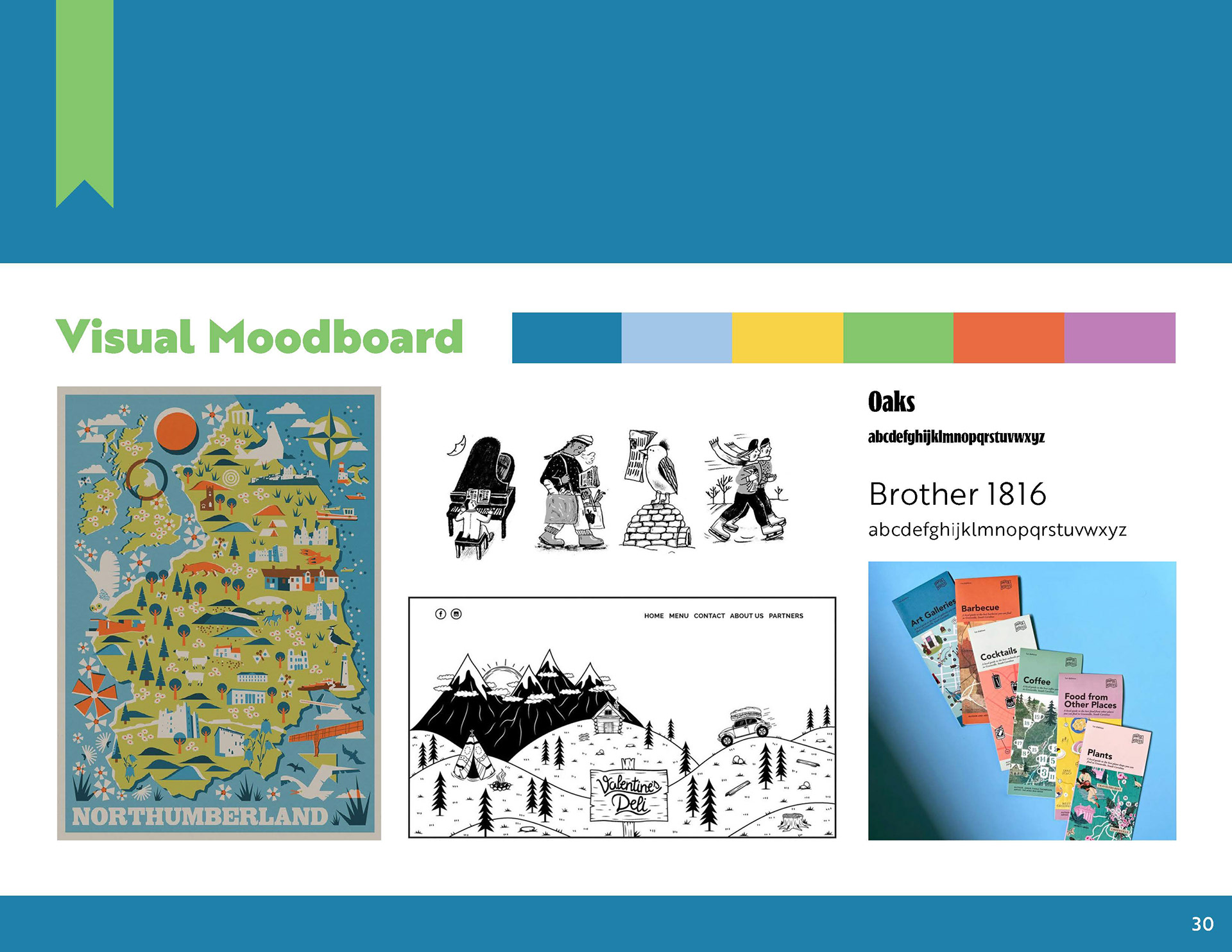
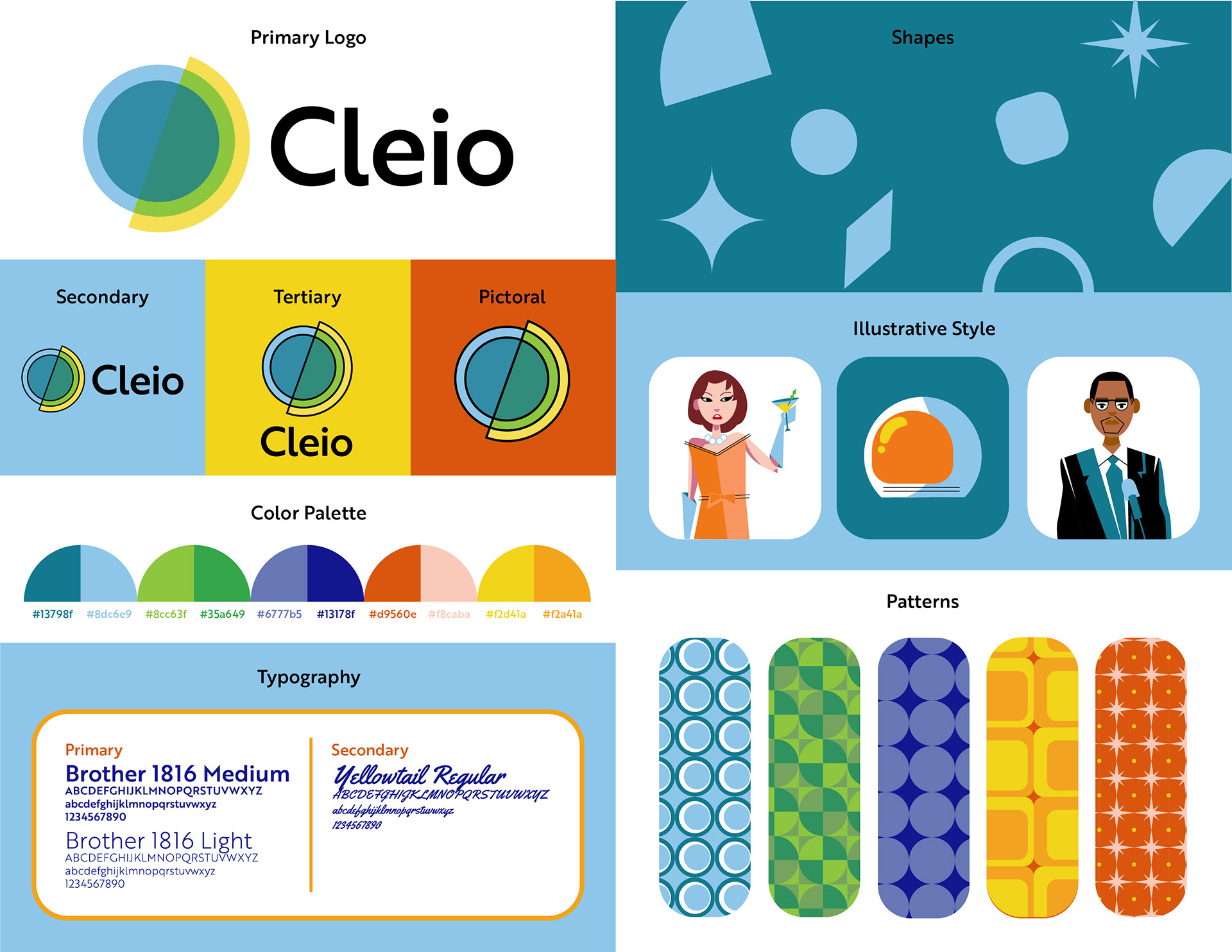
I chose to utilize the 1960’s aethstetic within Cleio’s branding to create consistency and appeal, while leaning into the timeless aethstetic of mid-century modern. The brand utilizes bright patterns, shapes, and colors, and the mid-century modern illustrative style to do this.
I chose to utilize the 1960’s aethstetic within Cleio’s branding to create consistency and appeal, while leaning into the timeless aethstetic of mid-century modern. The brand utilizes bright patterns, shapes, and colors, and the mid-century modern illustrative style to do this.
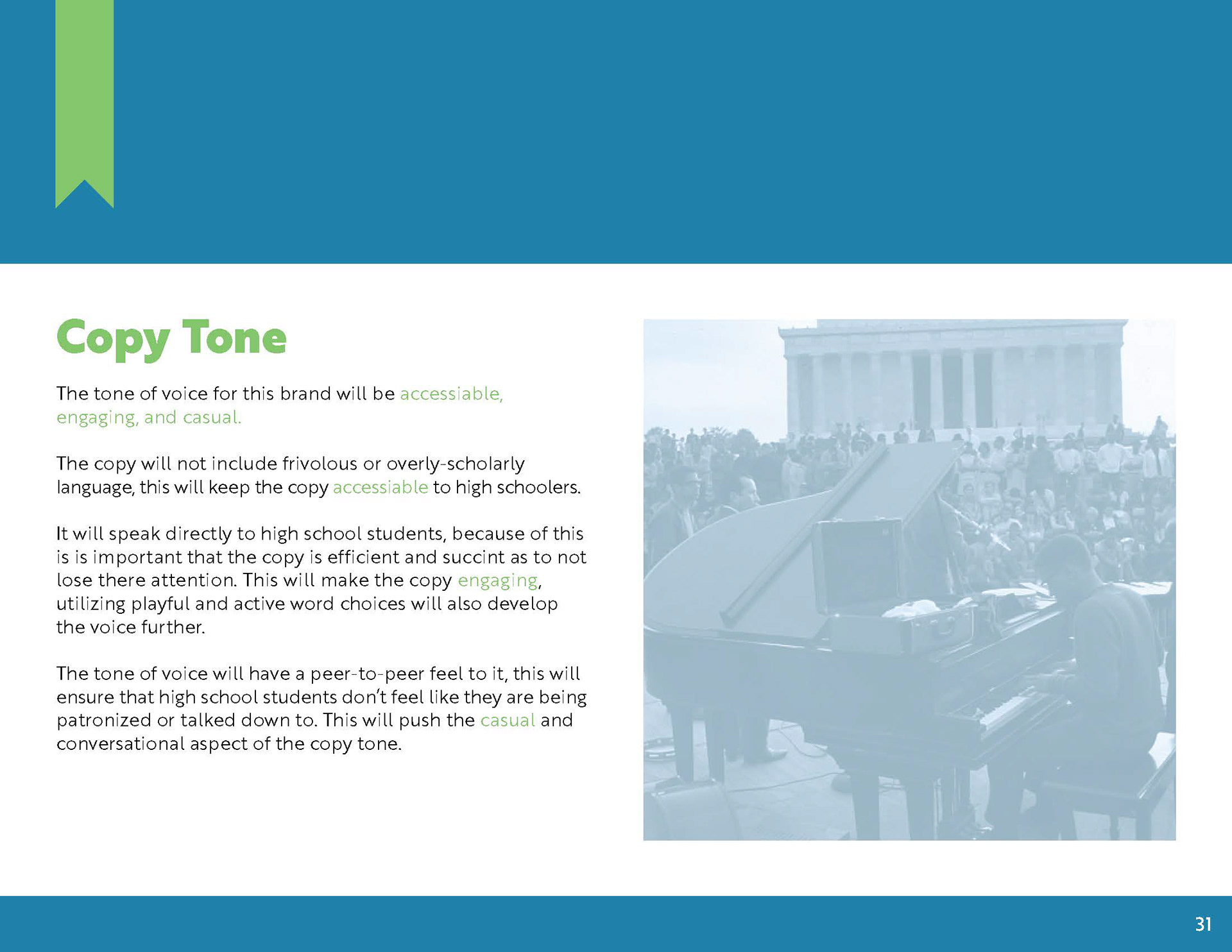
The branding is playful without coming across as childish. It remains mature but not too serious. This is all purposeful so that high school students can connect with the materials without feeling talked down too or patronized. The branding is conversational and inviting and remains consistent throughout the brands different learning formats.
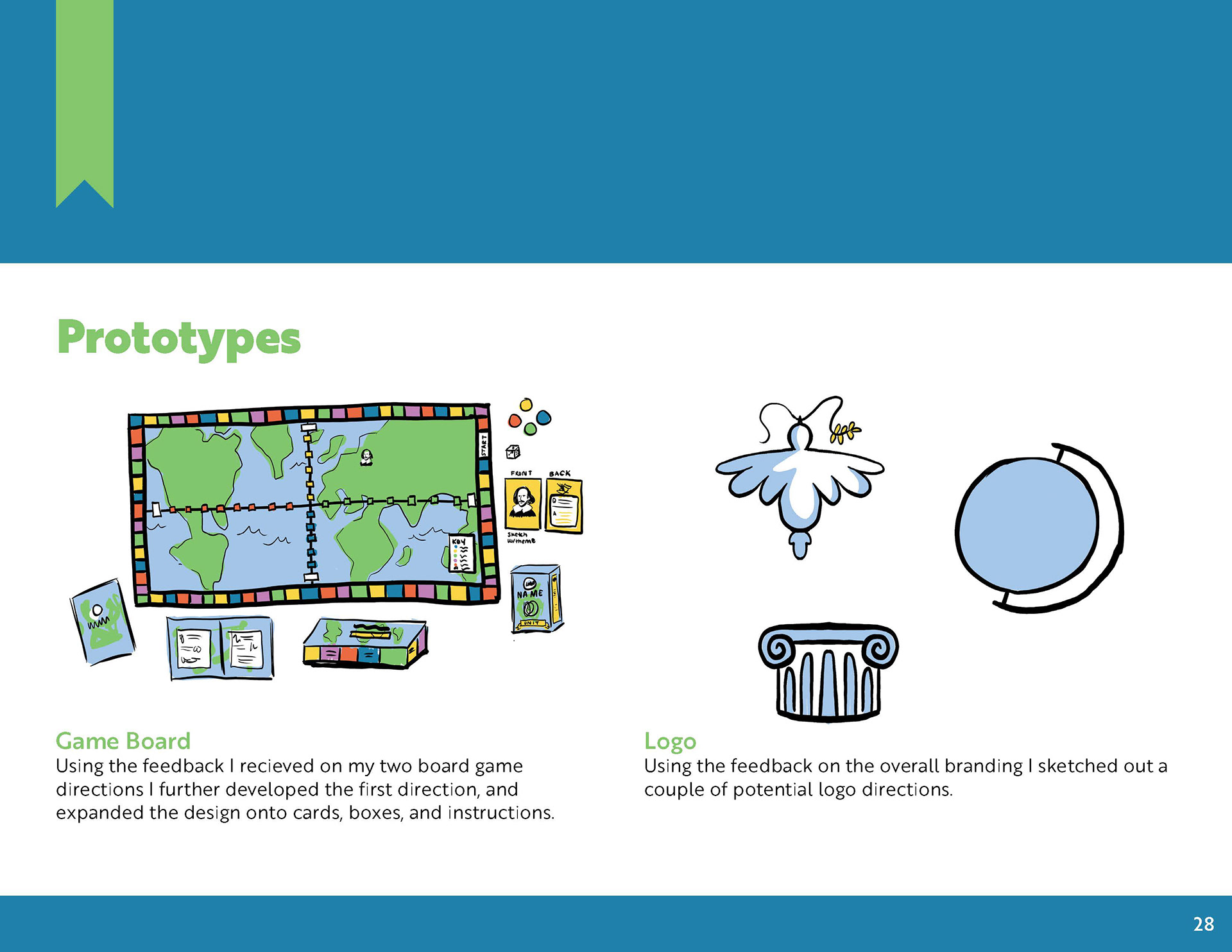
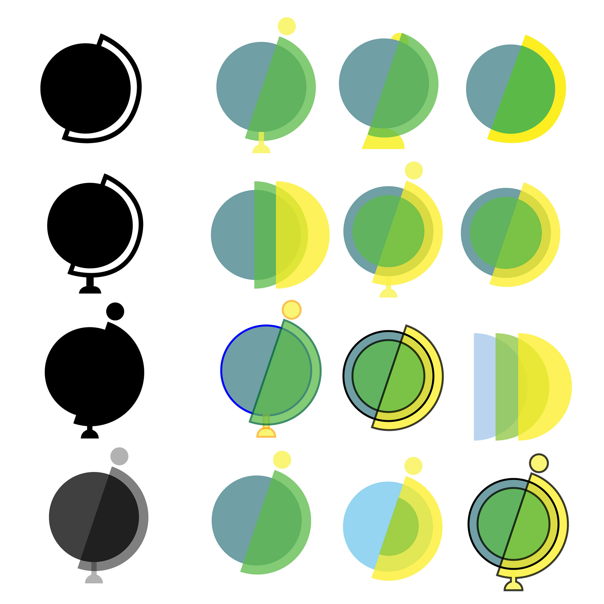
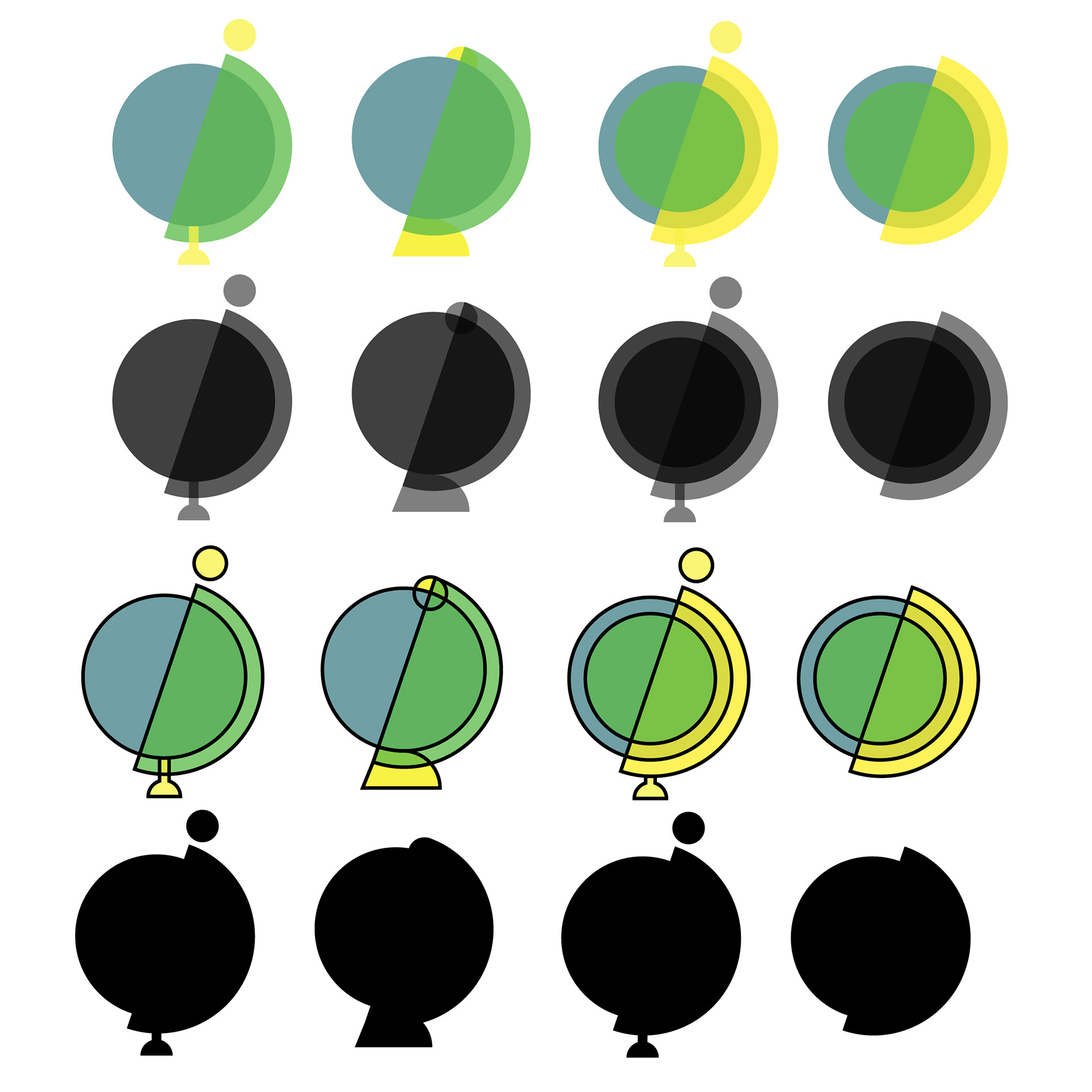
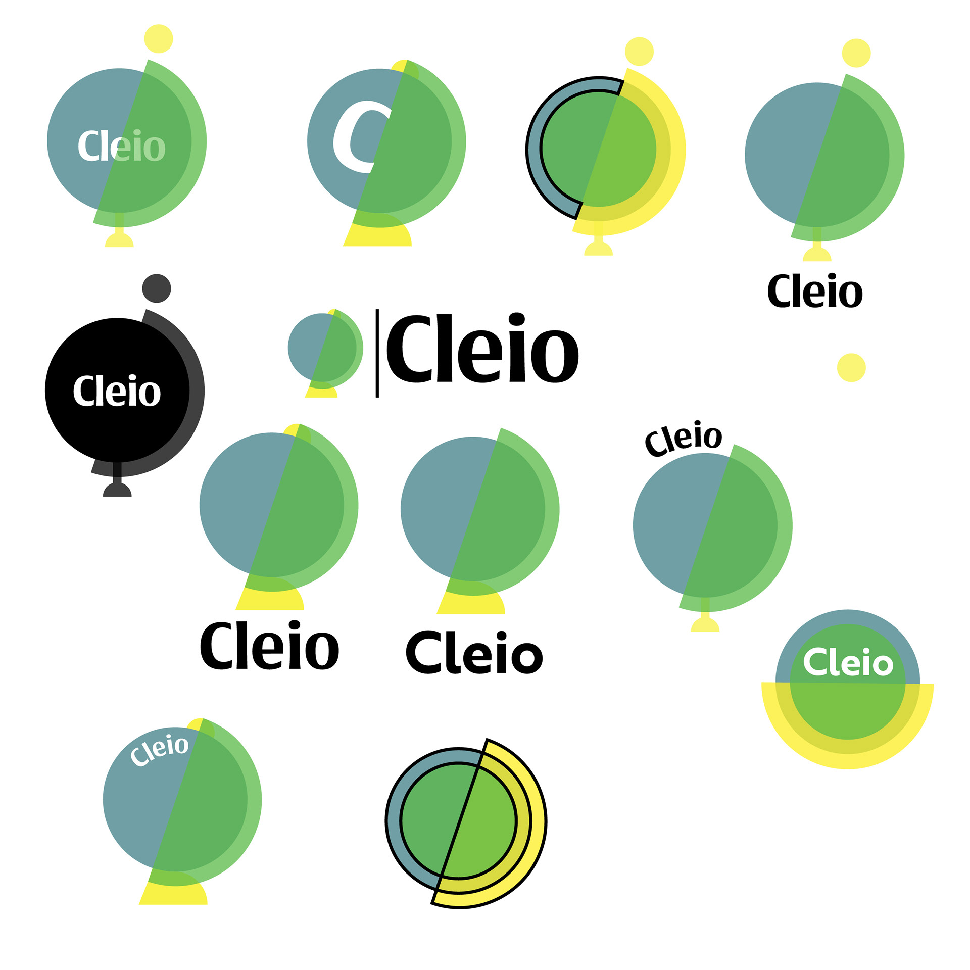
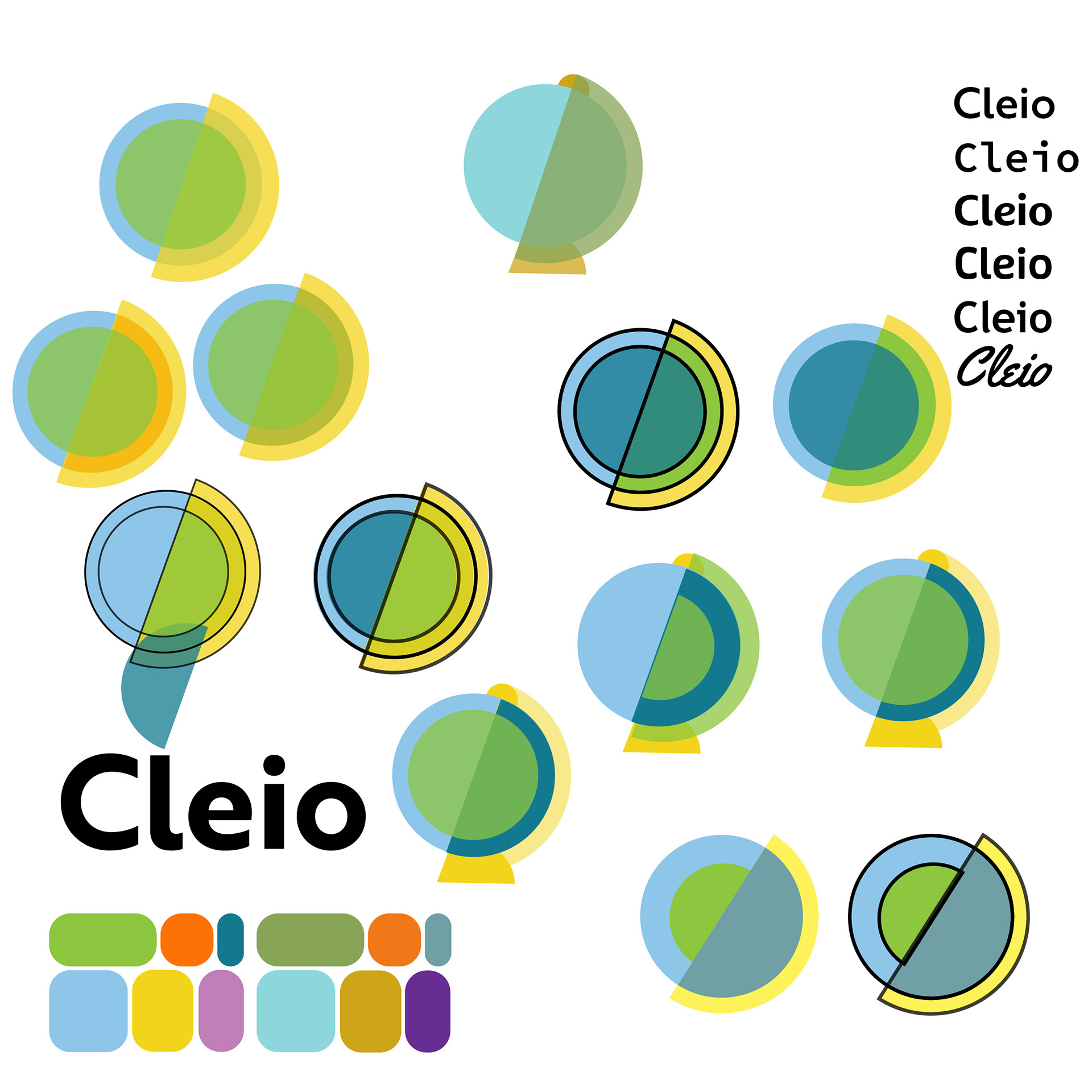
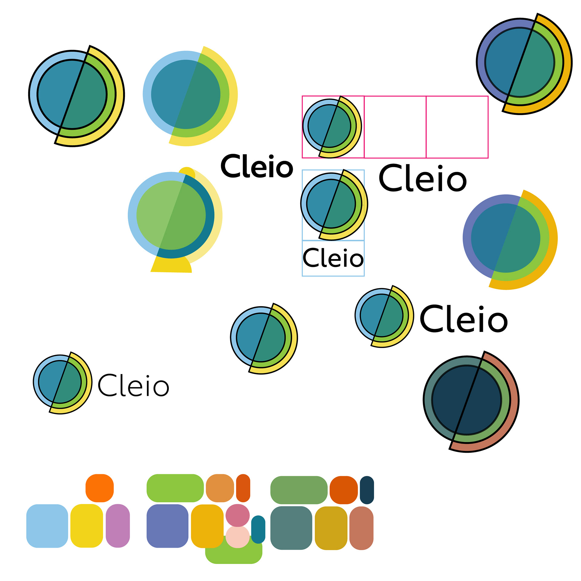
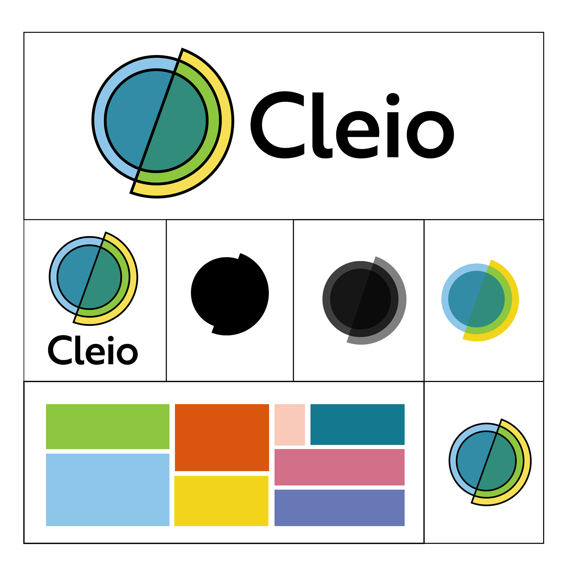
LOGO IDEATION The photos below depict my process of creating of the brands logo. I began with the idea of abstracting a globe, and came up with three main globe silhouettes as a starting point. From there I played with them until I began to see results I liked. I leaned into the mid century modern aesthetic via my shape choices. I used overlapping color to create depth and visual intrigue. Ultimately the logo represents the global impacts of history, even when focusing on a single country.
AMERICANA: THE BOARD GAME
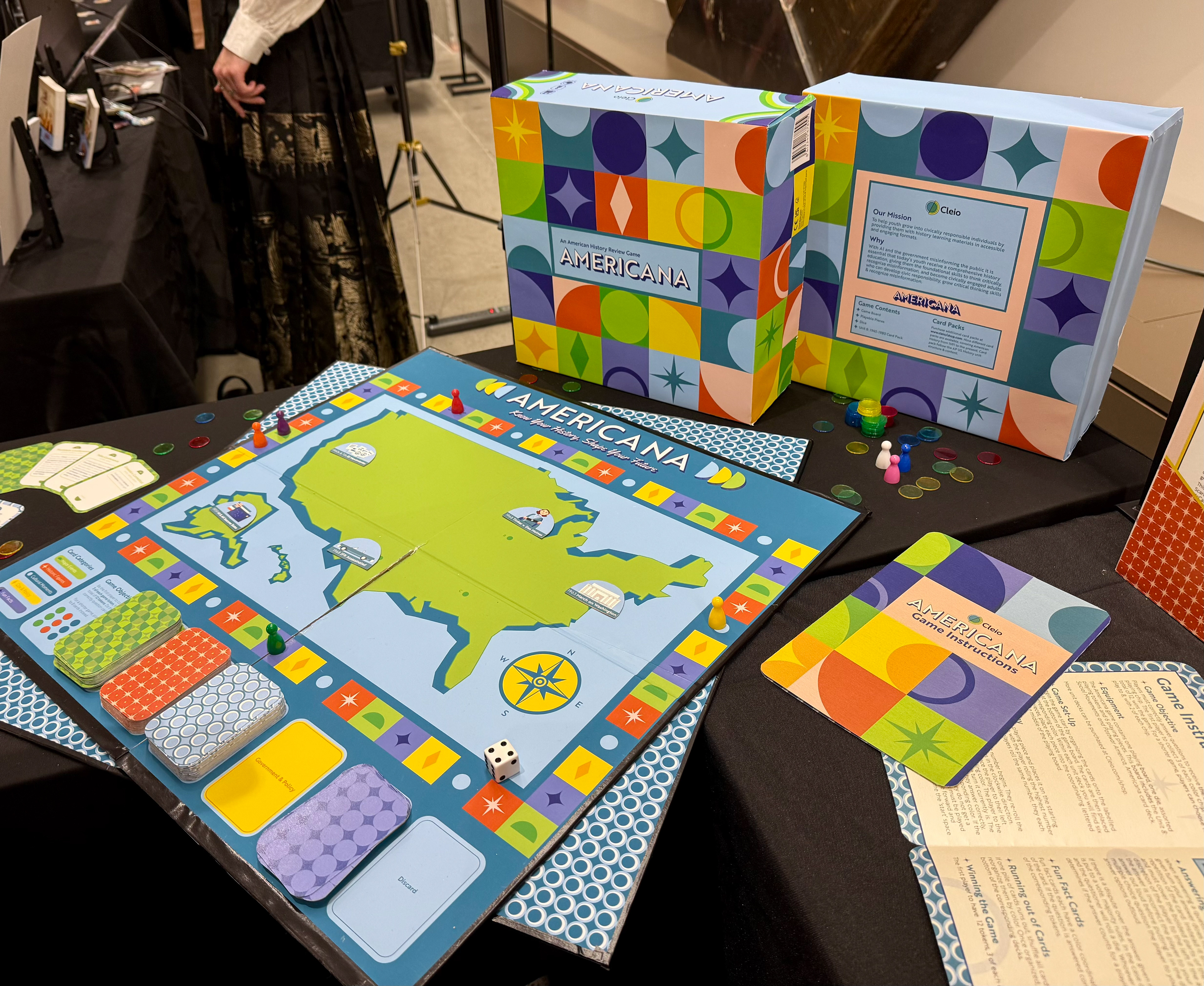
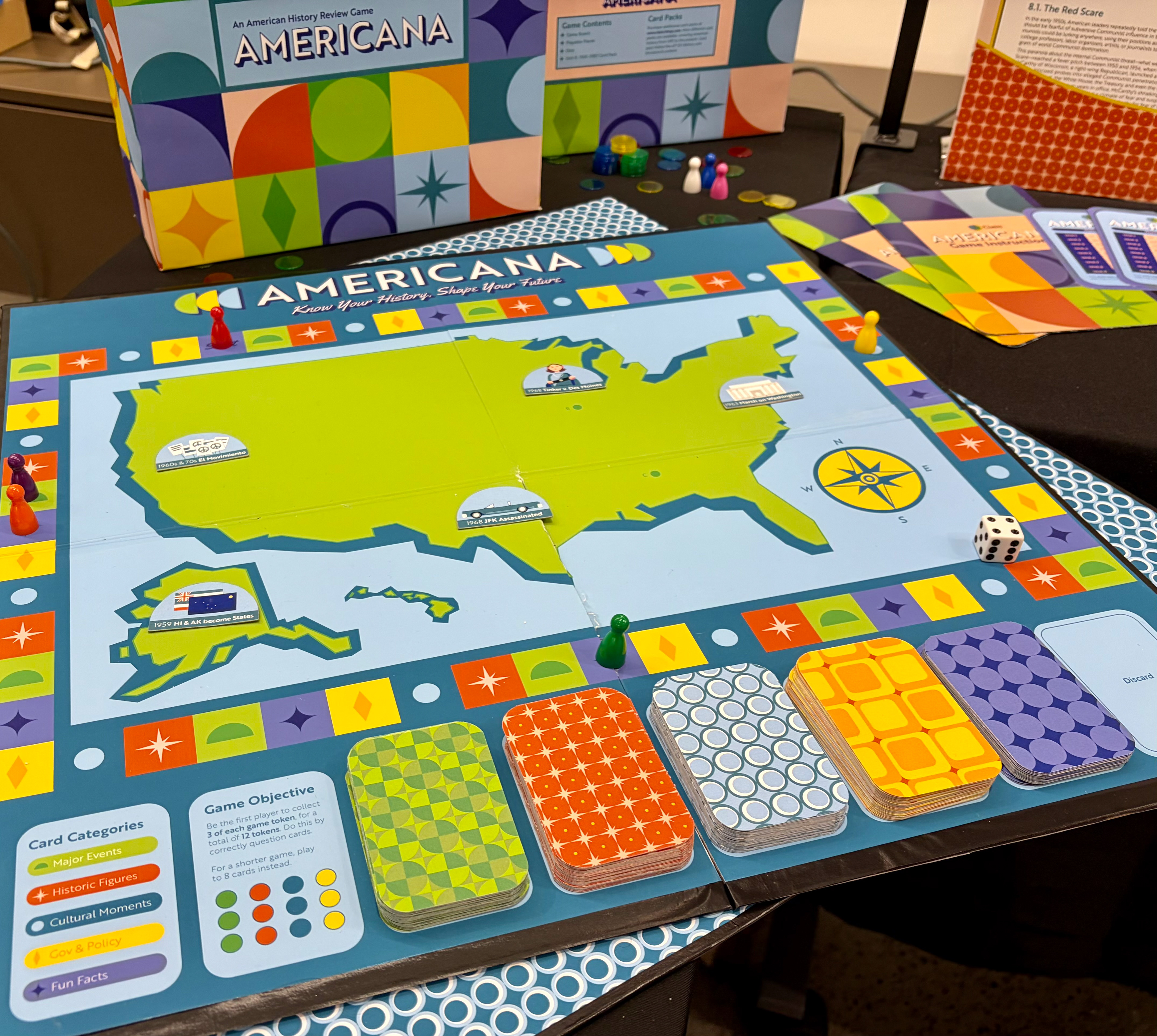
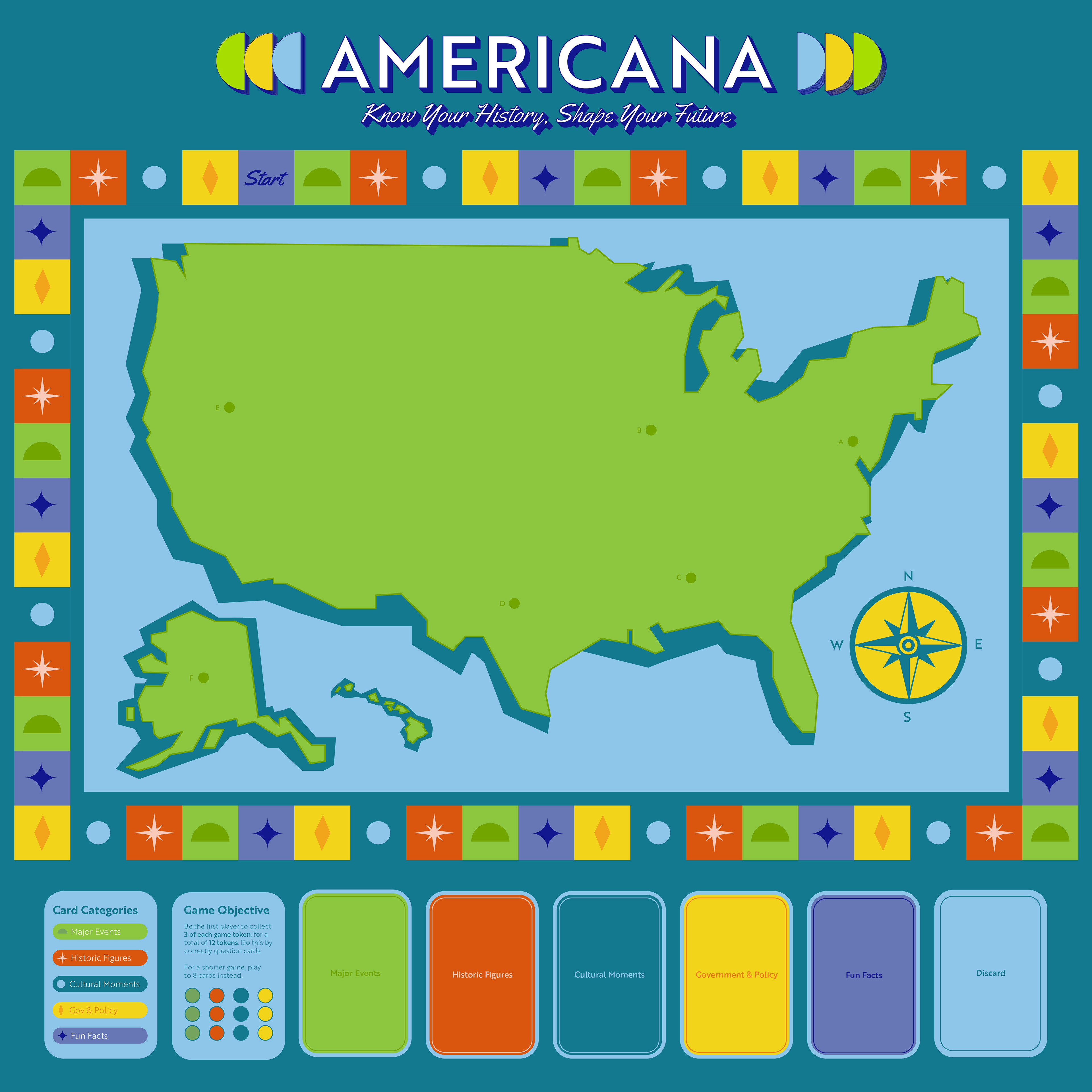
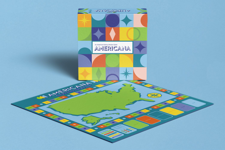
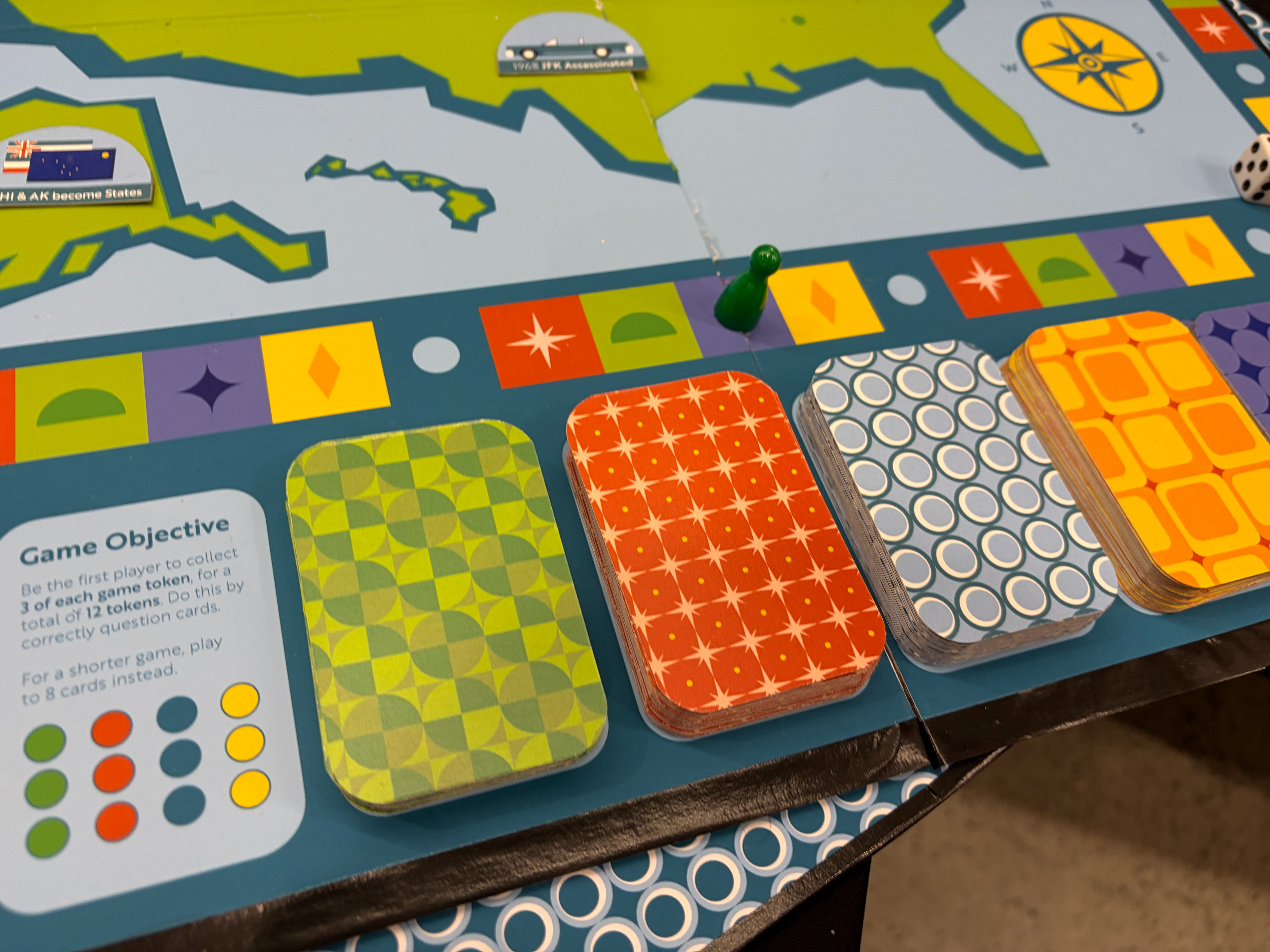
THE BOARD The game board depicts a map of the United States, and utilizes the bright colors, fun shapes, and eccentric patterns of the branding system. Because of its simplistic design, game play is almost intuitive, making the game accessible to all.
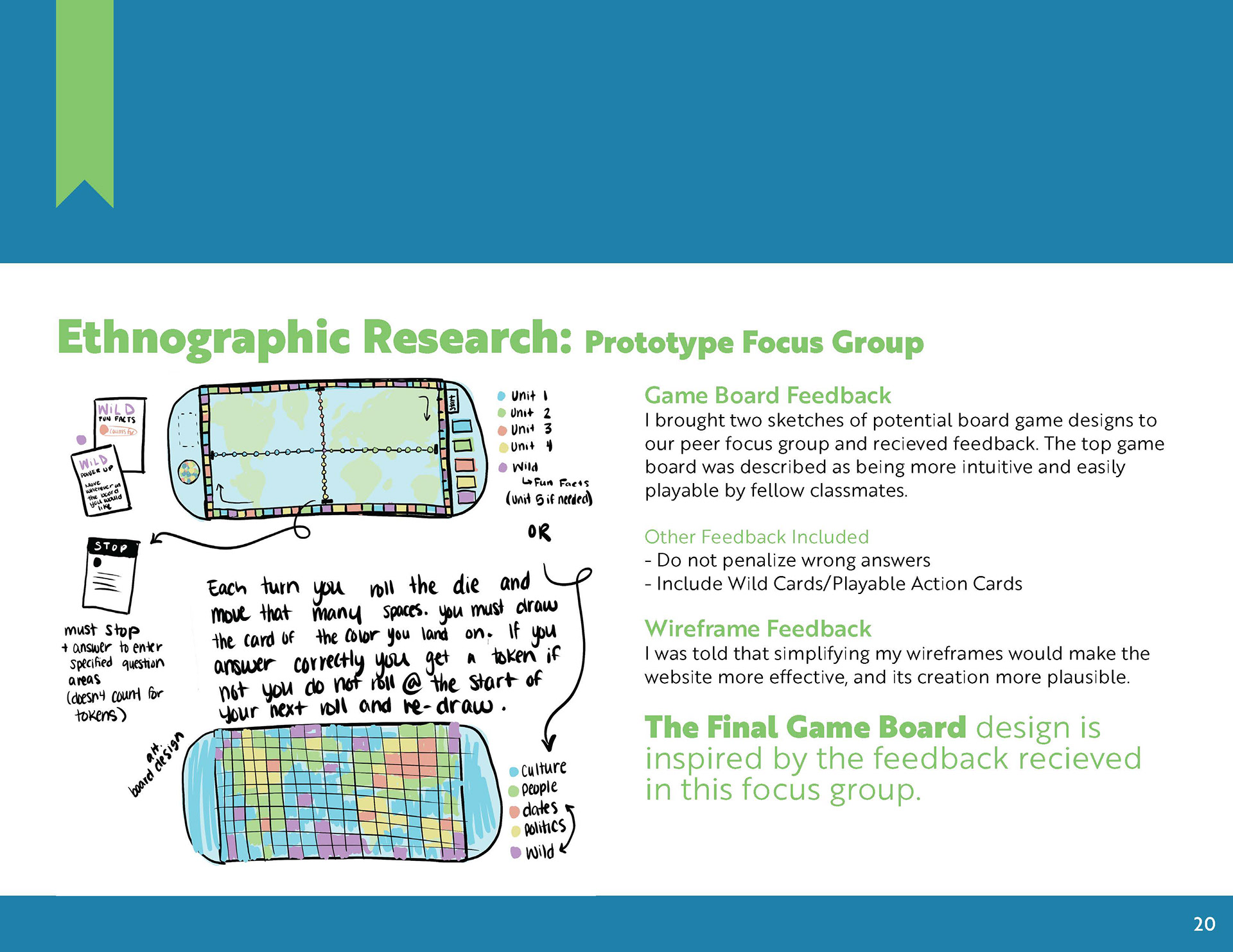
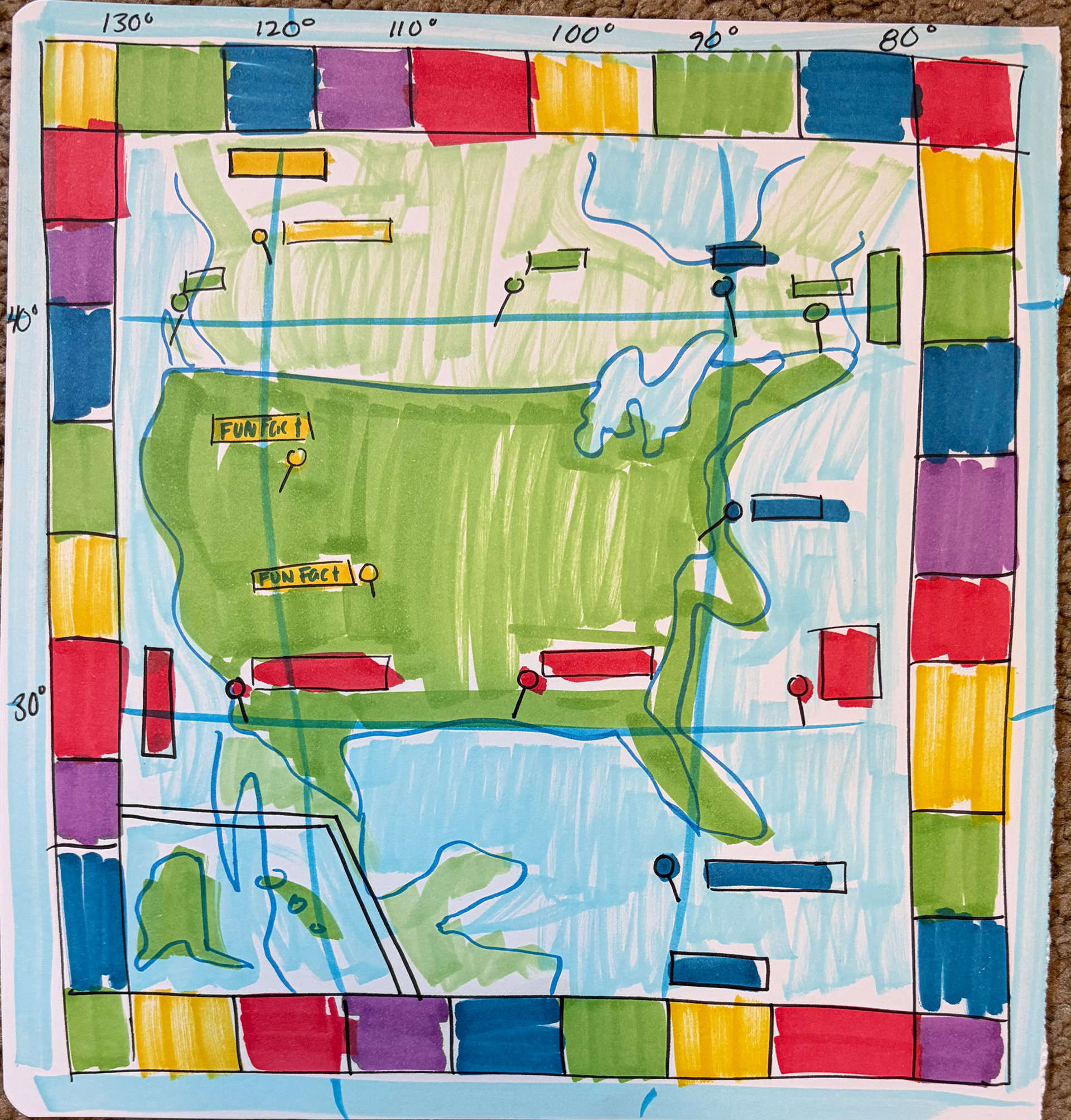
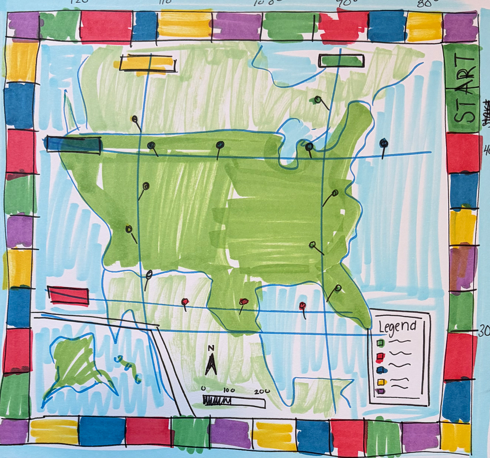
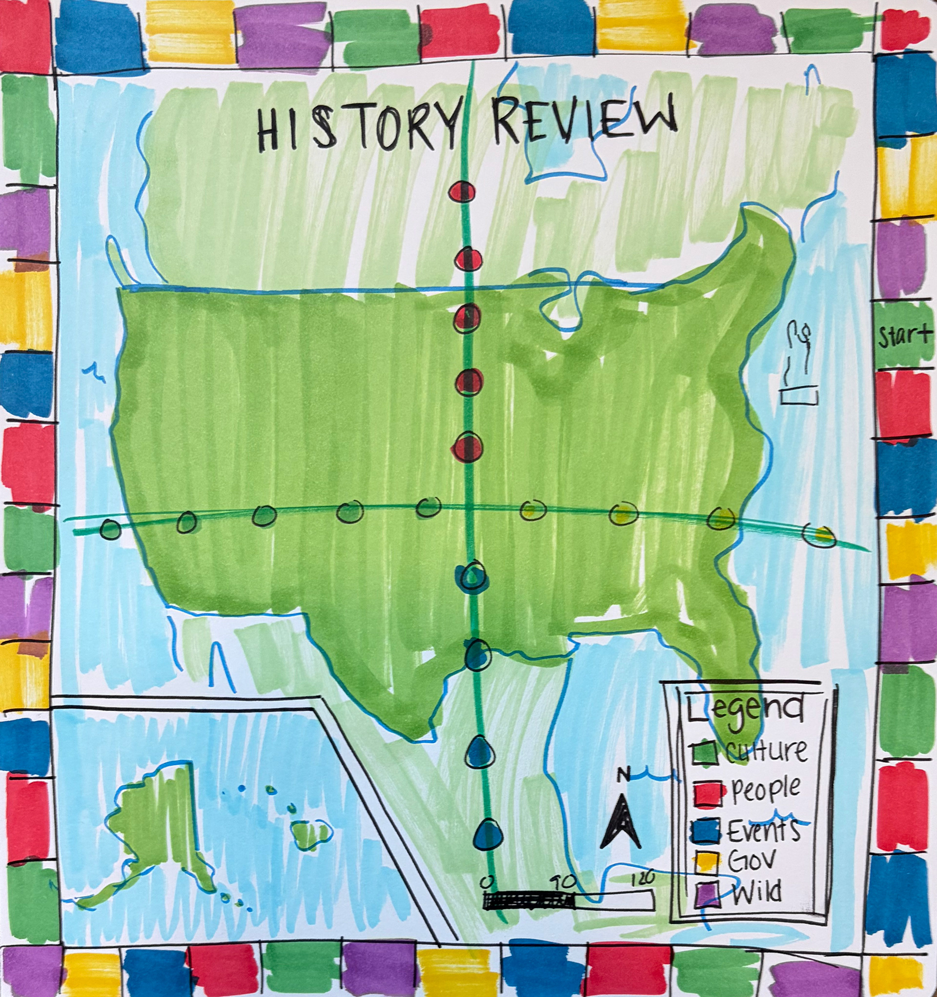
SKETCHES I explored different ways I could utilize map elements on the board via sketches before committing to the final design. Below are some sketches I did before digitally designing the board. Elements from these sketches can be found in the final game.
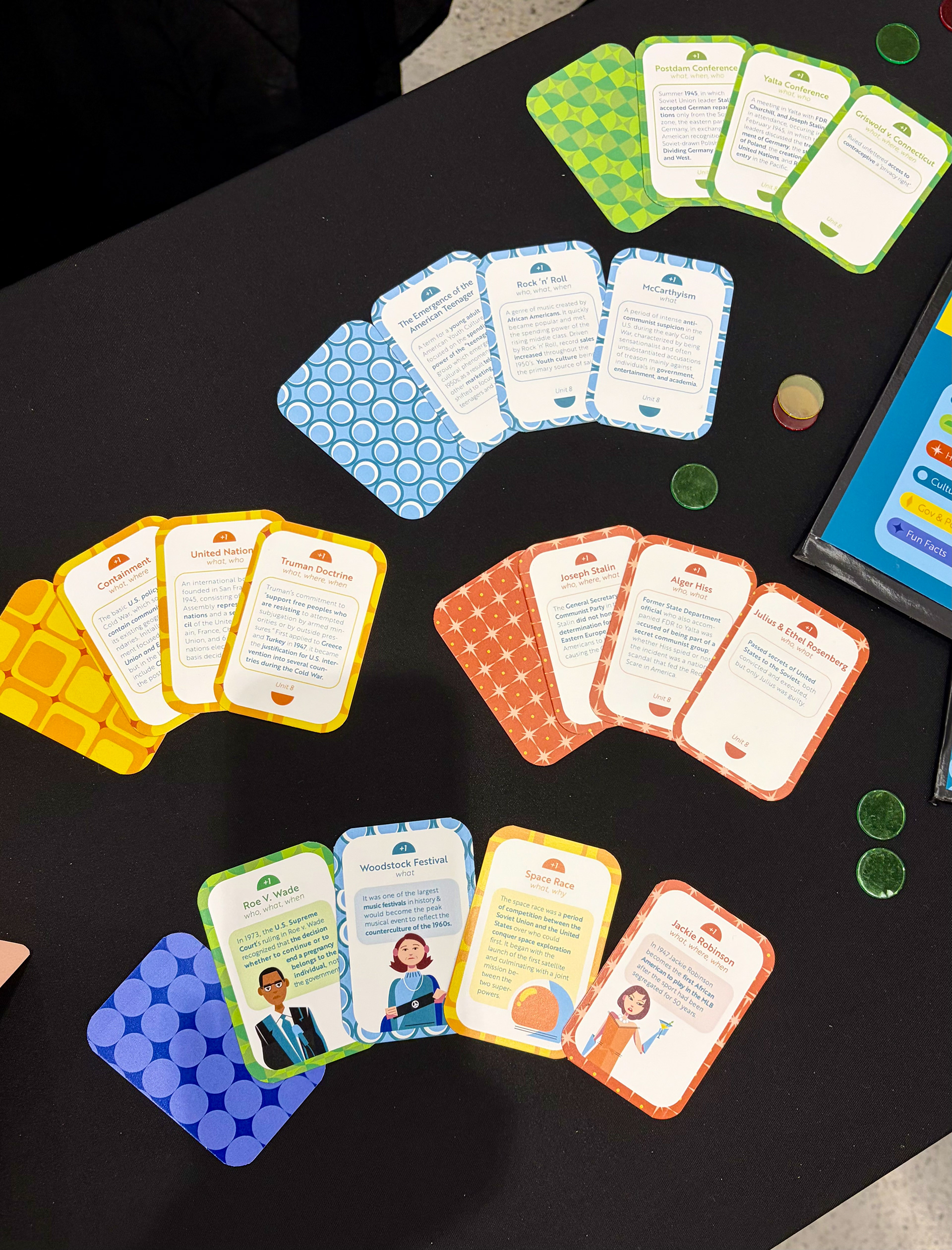
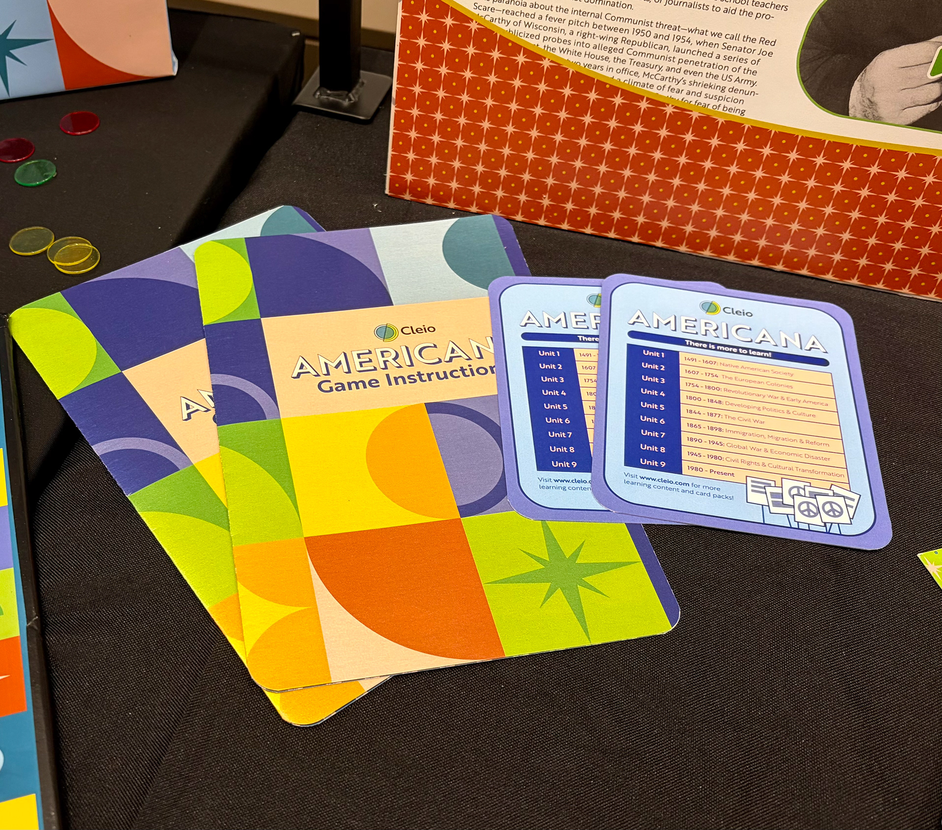
GAME CARDS The game cards utilize the brands patterns to add a point of interest to the bottom of the board. They are color coordinated with the spaces on the board. The purple 'fun fact' cards include illustrations.
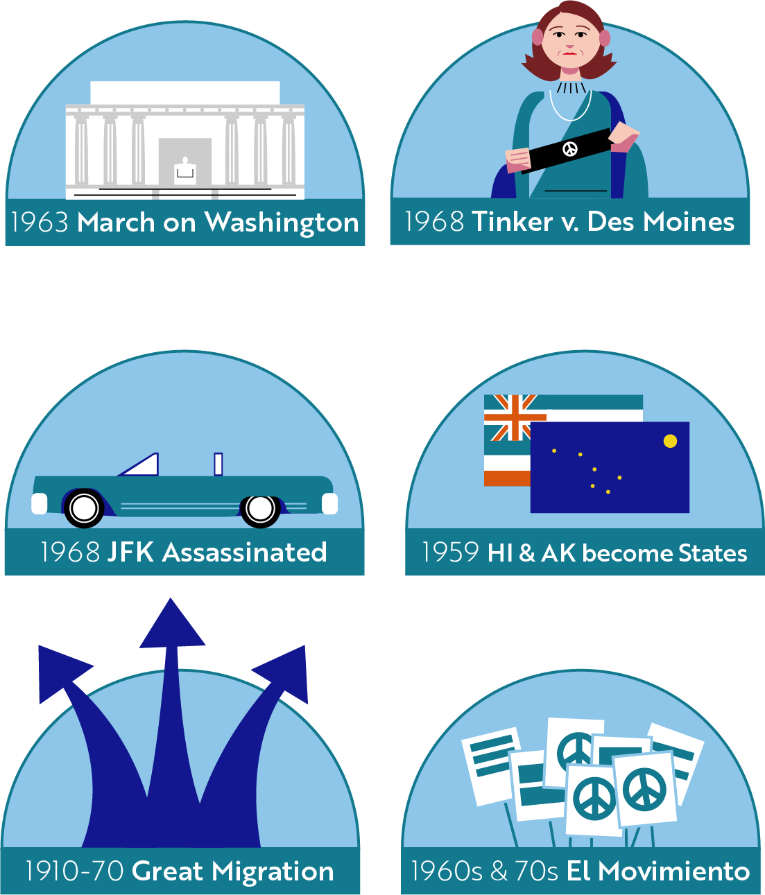
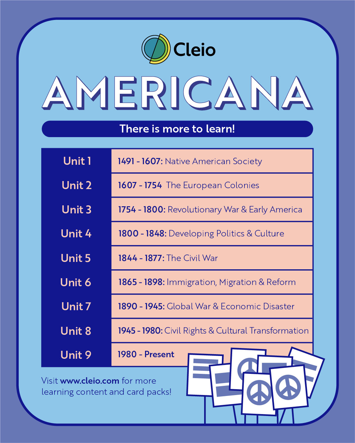
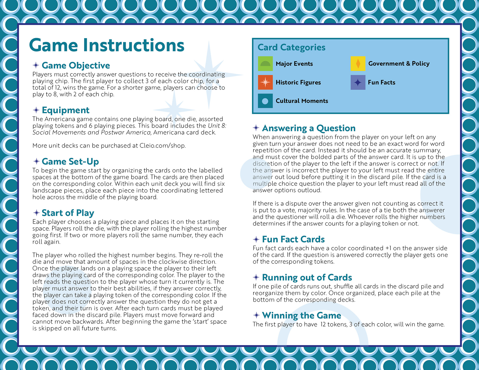
OTHER ELEMENTS Other elements of the game include removable event pieces. These illustrated pieces (top left) represent major historic events happening in different regions of the country, and are placed on the board before playing. There is also an advertisement piece which shows all the different units of the game (top middle), and finally the games instructions (top left & bottom row). These elements were made to add more realism and depth to the game and brand and show more examples of brand application.
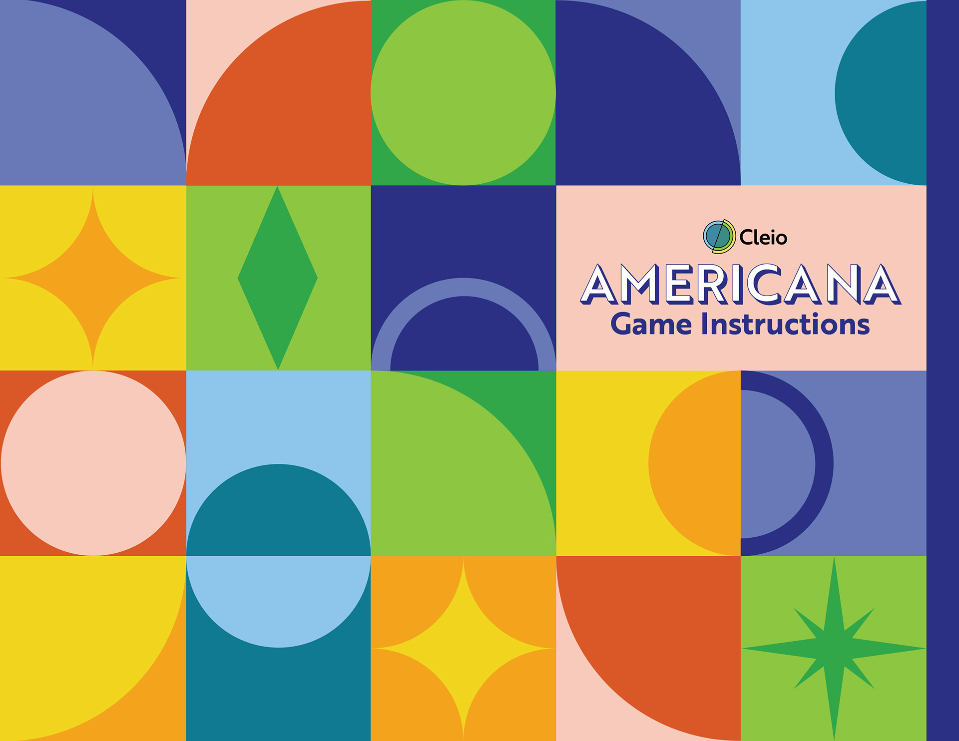
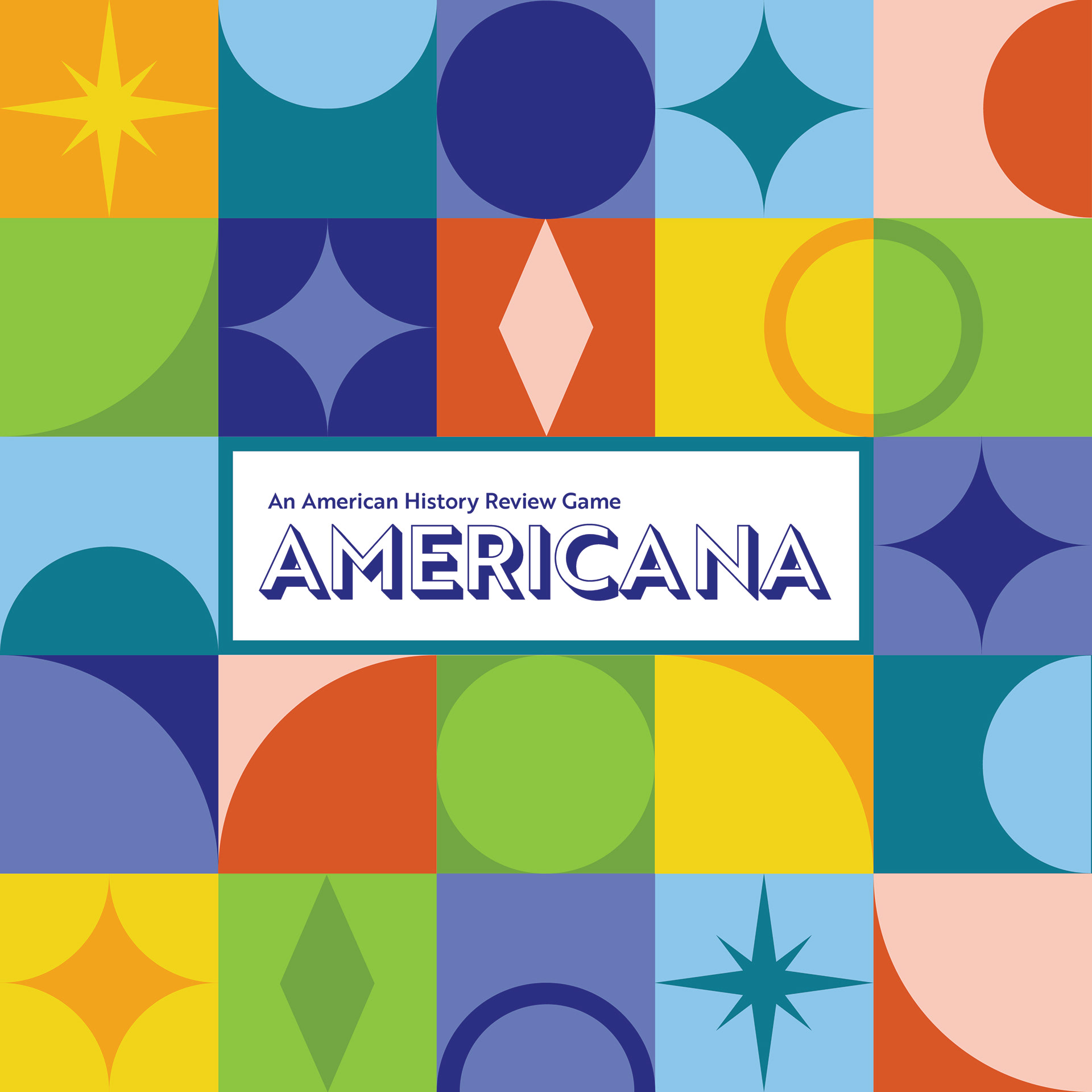
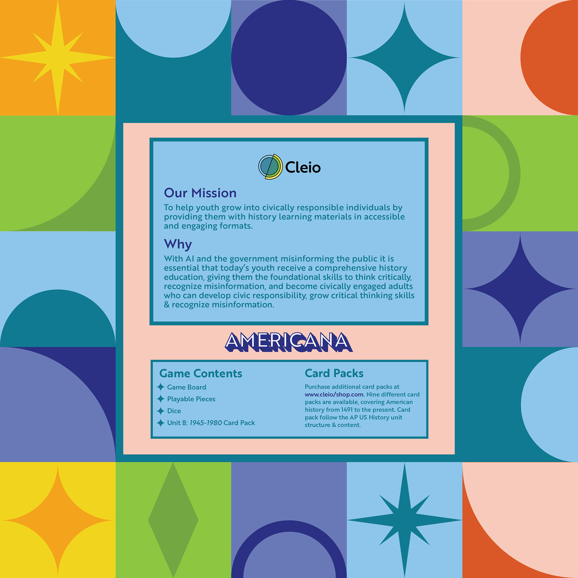
GAME BOX Below is the top and bottom of the game box. The game box is a bright and bold application of the Cleio branding system, and focuses on utilizing the brands shapes and colors.
WEBSITE
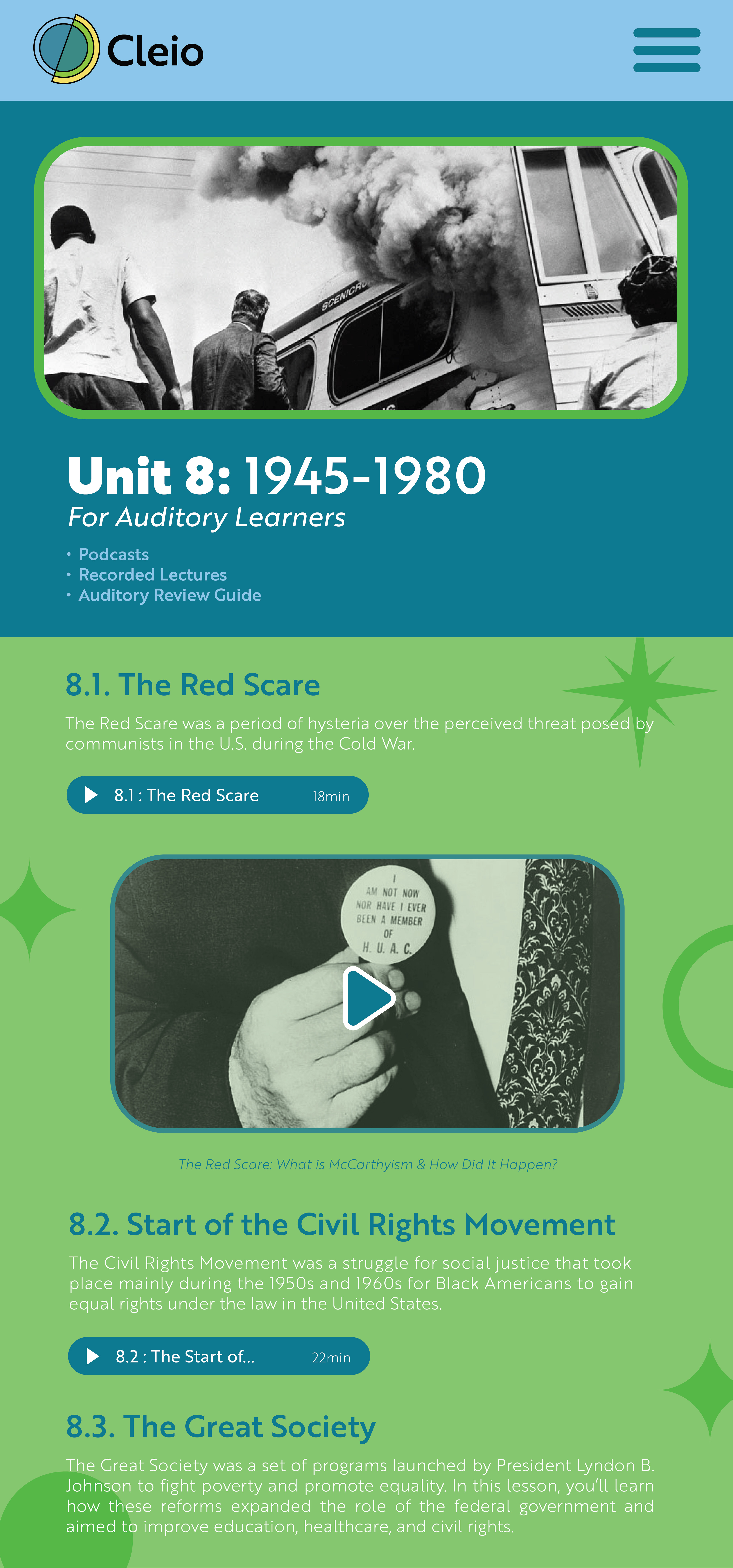
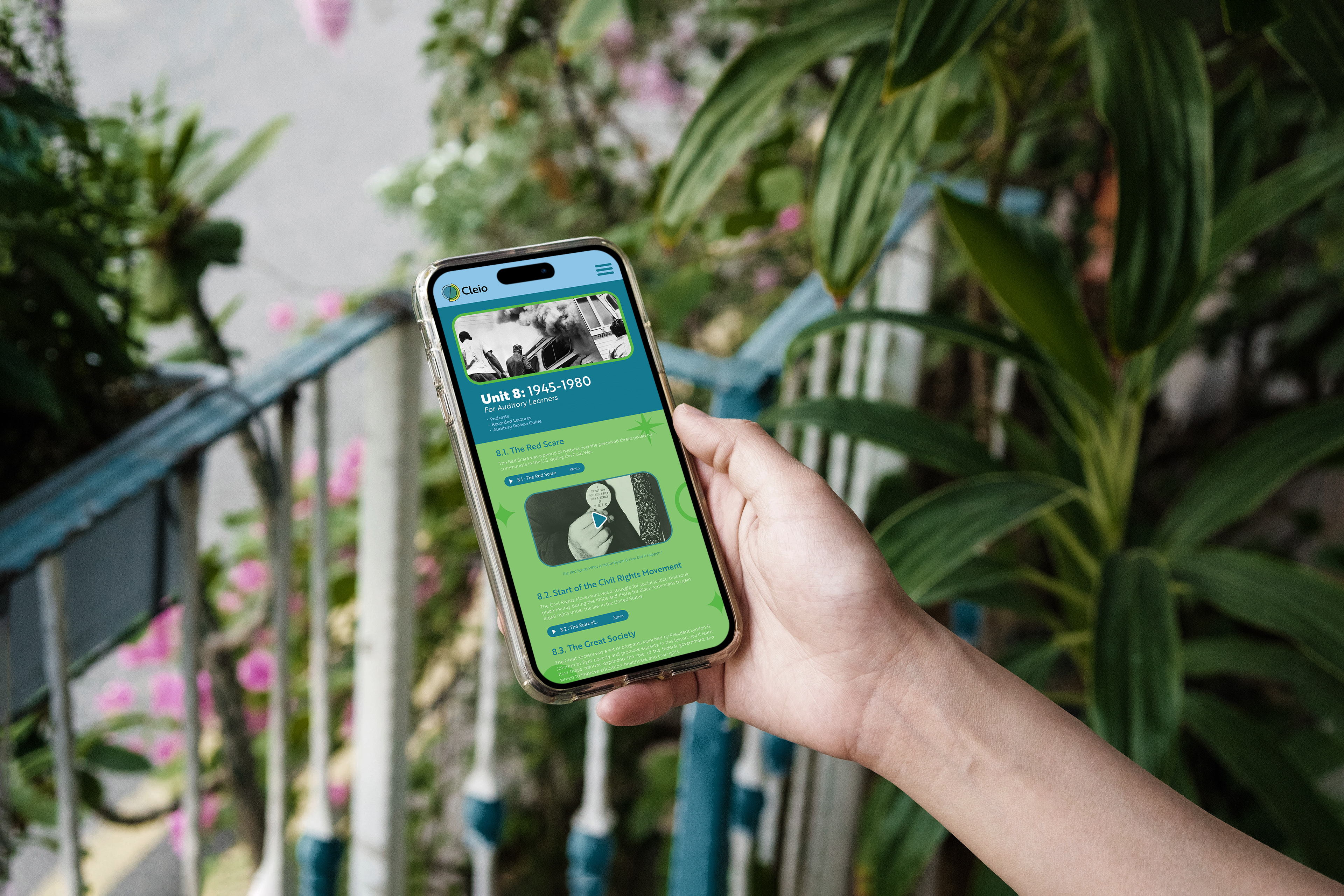
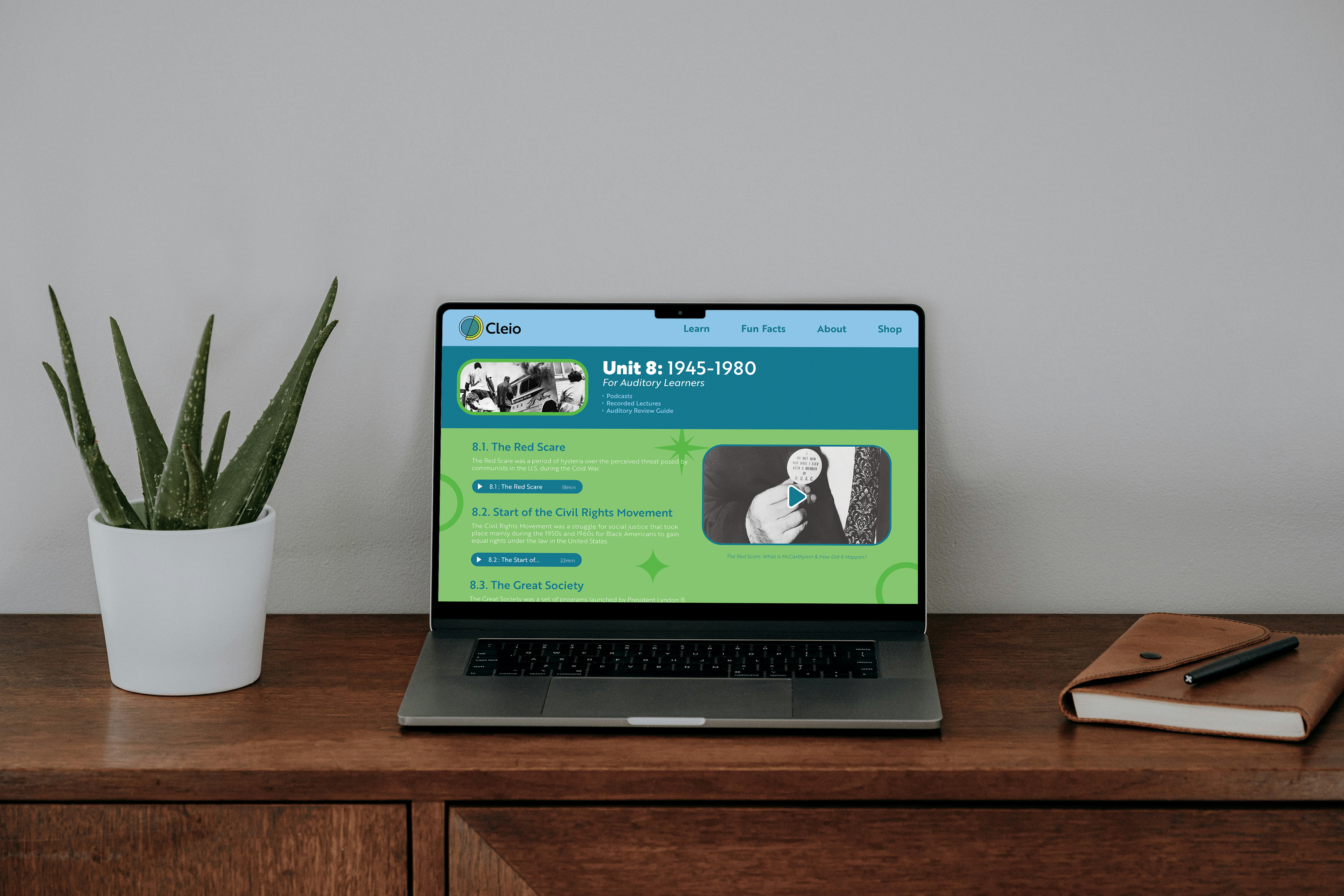
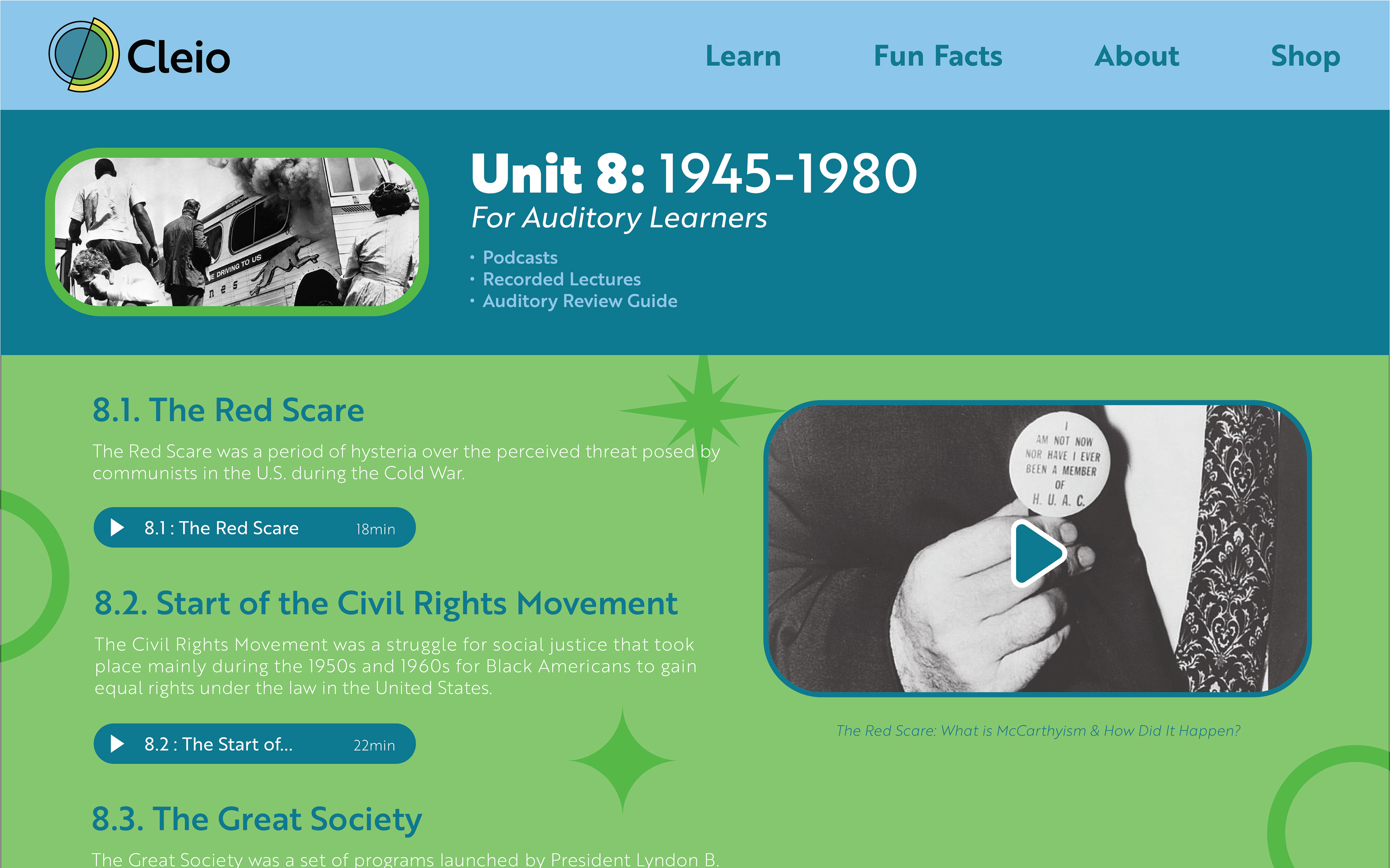
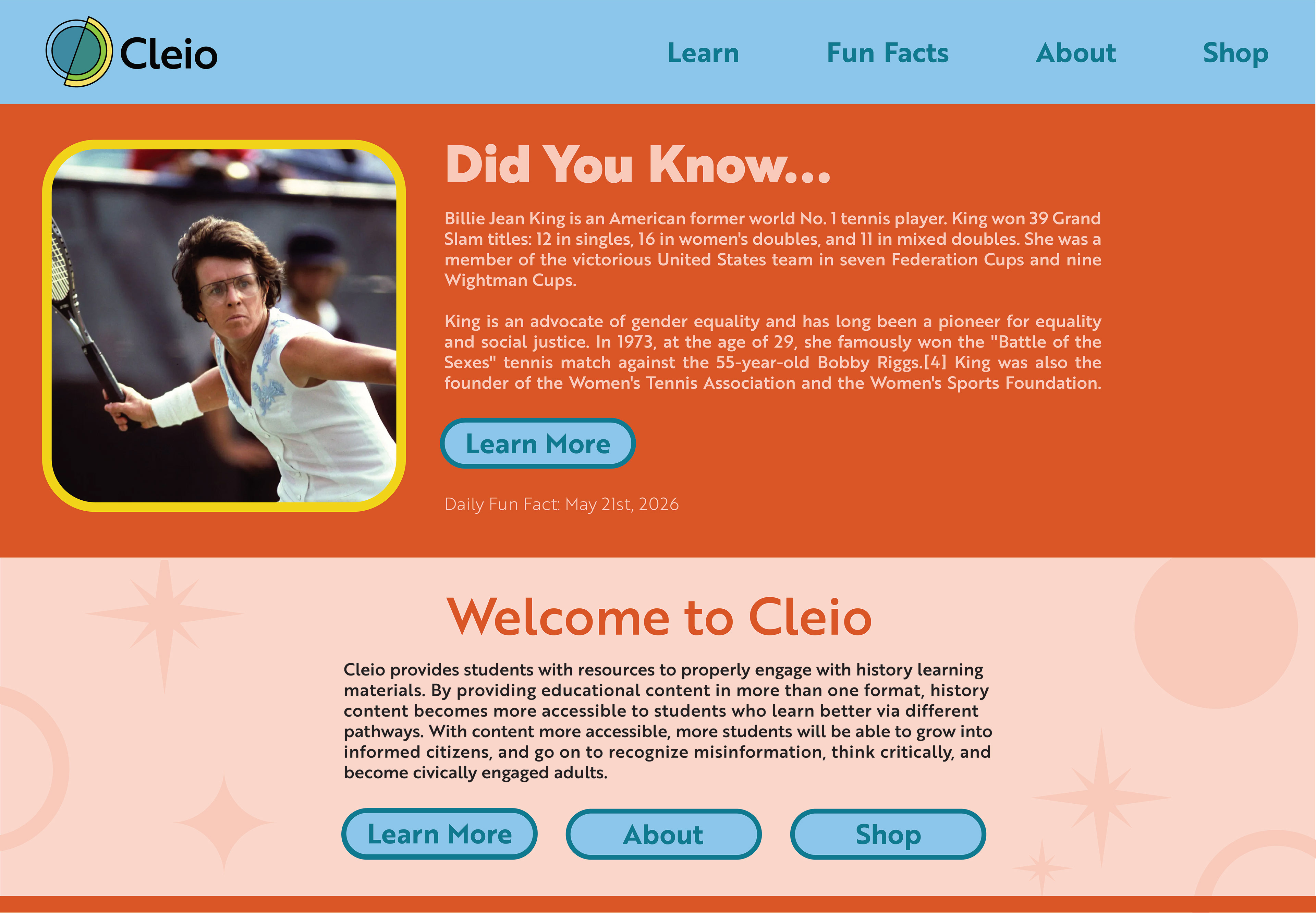
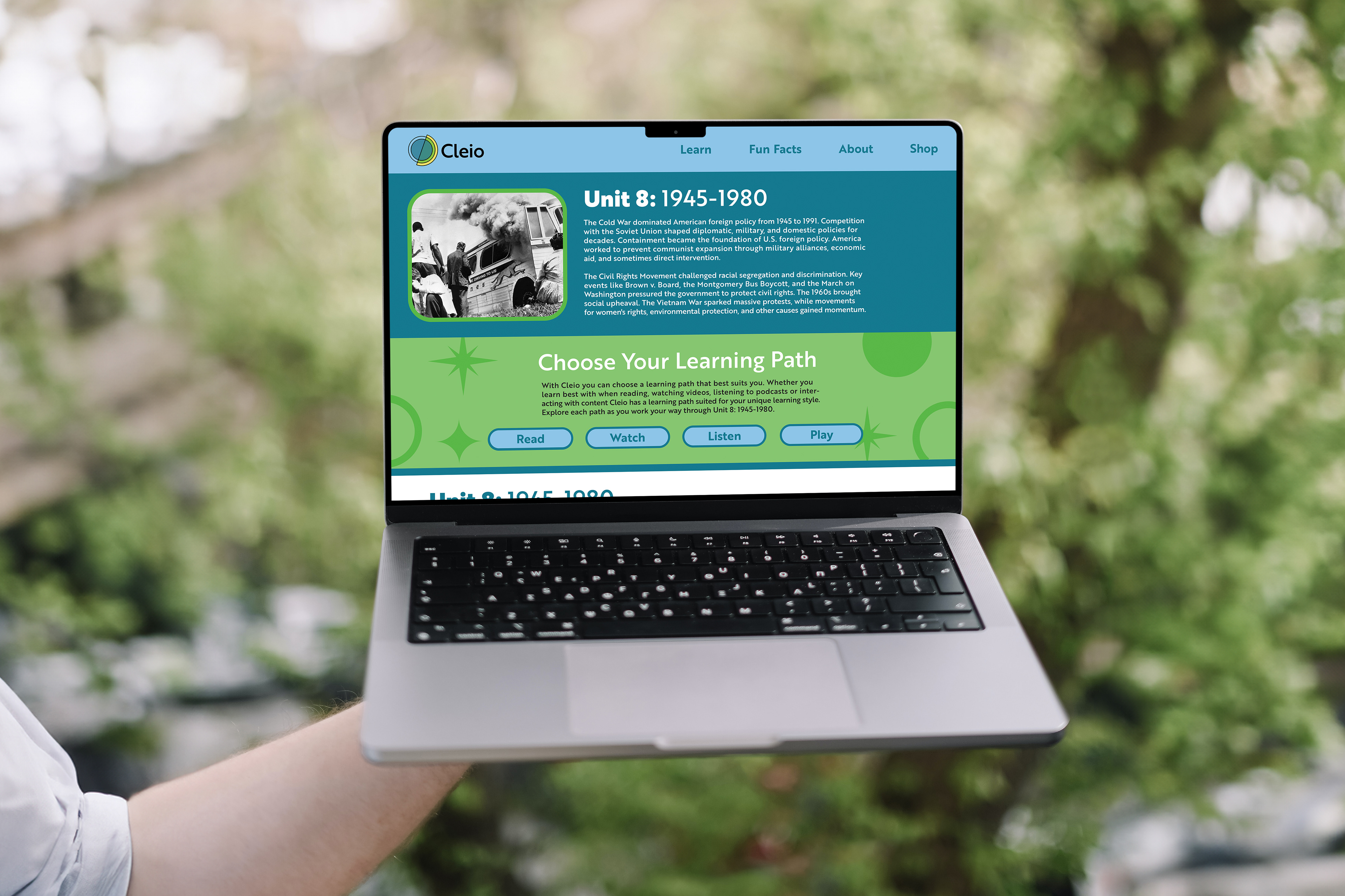
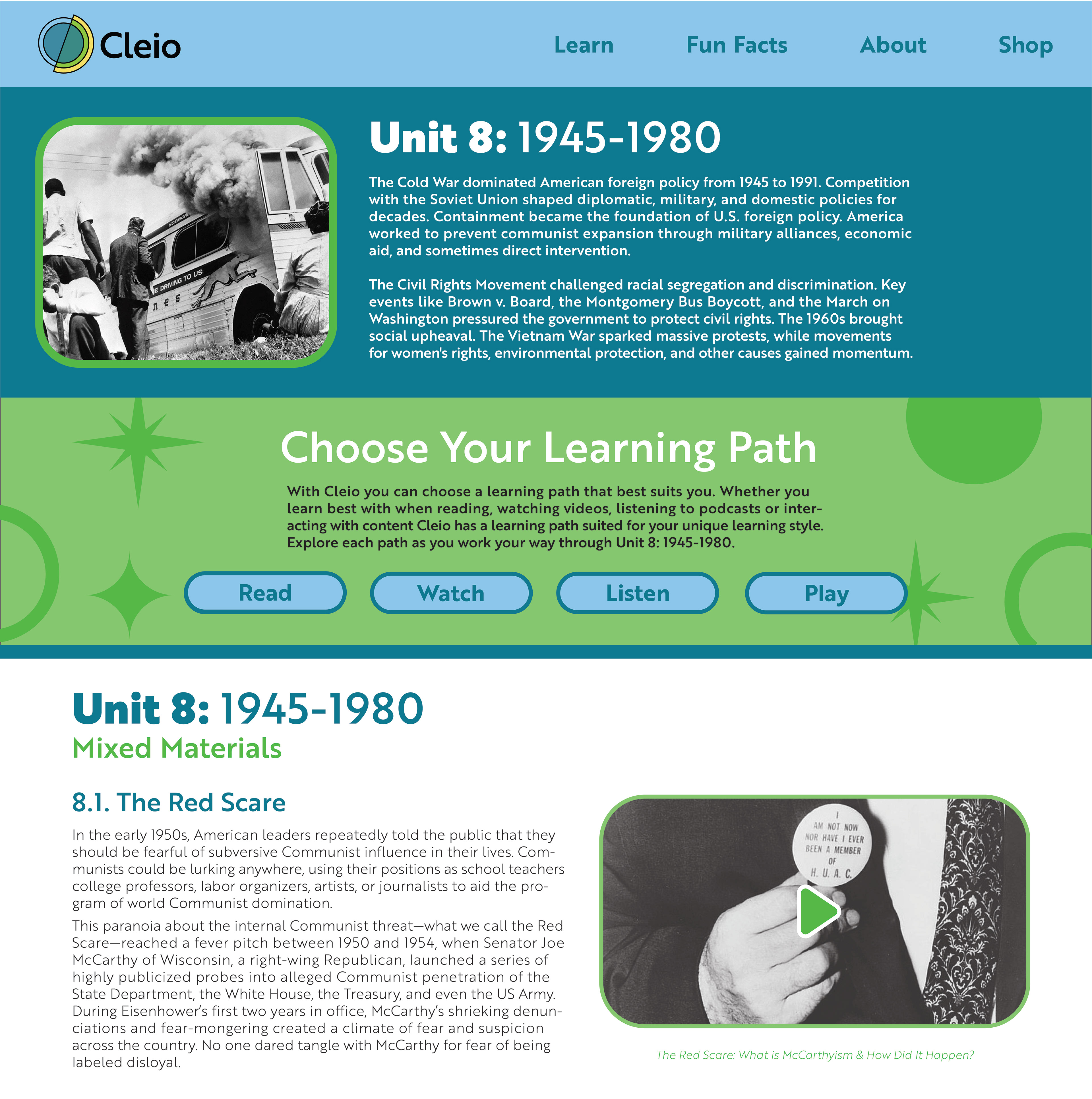
Cleio's main goal is to give students the opportunity to choose their own learning path. To demonstrate this the learning content needed to be available to students in another form other than the board game. The Cleio website gives students access to learning content in a variety of mediums including podcasts, videos, readings etc. Effectively giving students the option to choose their own learning pathway, and agency in their educational journey.

TAKEAWAYS
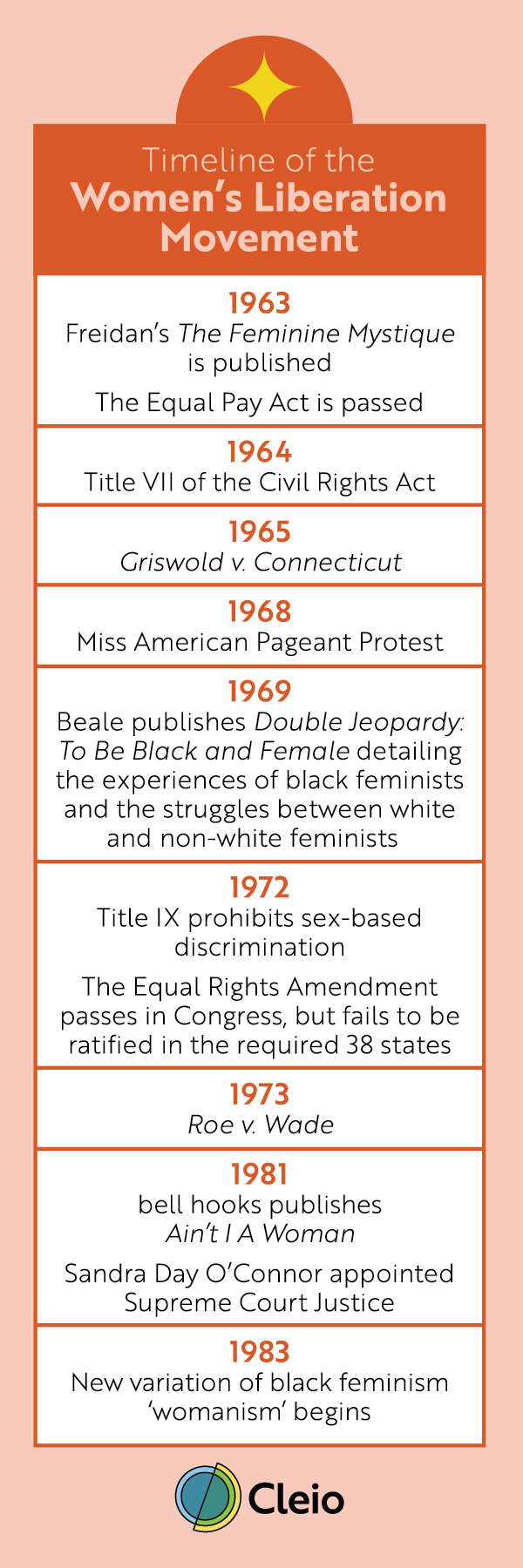
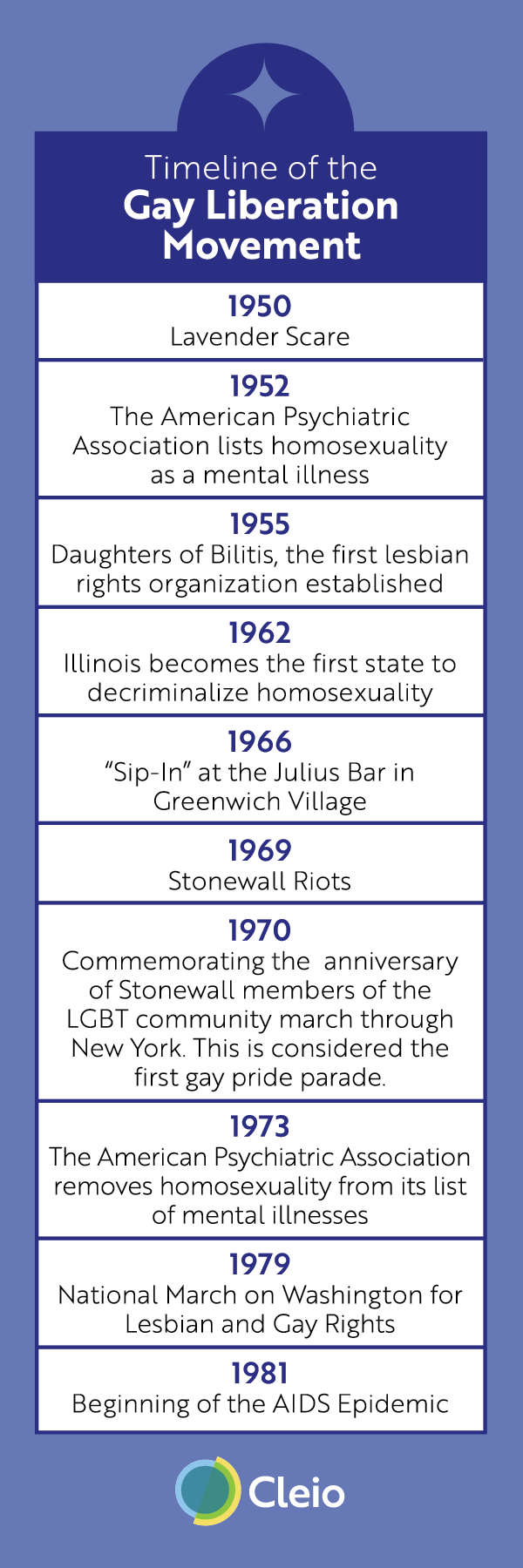
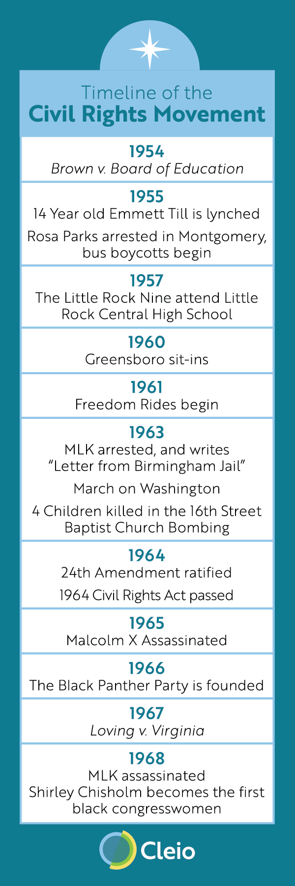
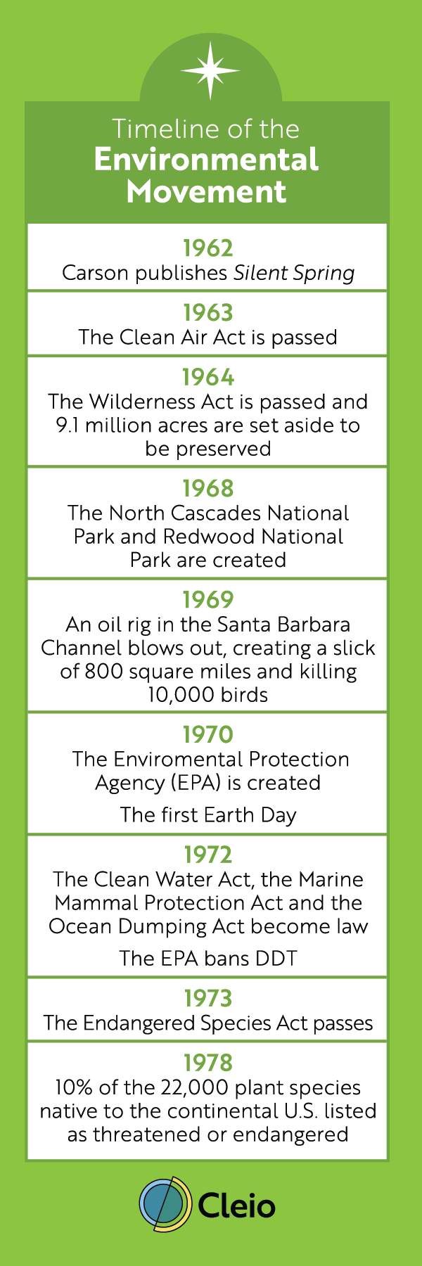
Takeaways which were placed on my table at the capstone event included stickers and the bookmarks seen below. These bookmarks each included a timeline of a major movement in American history.



PROCESS
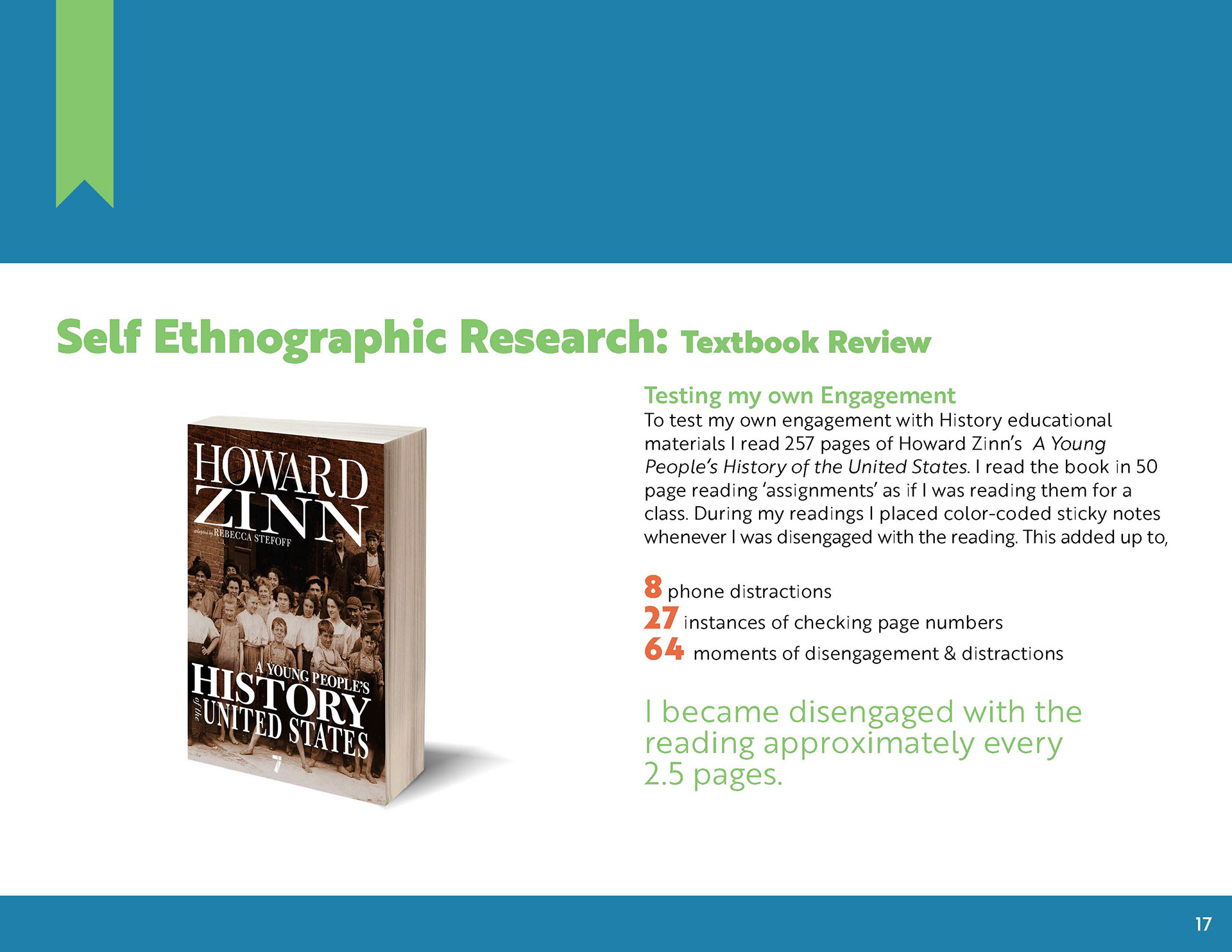
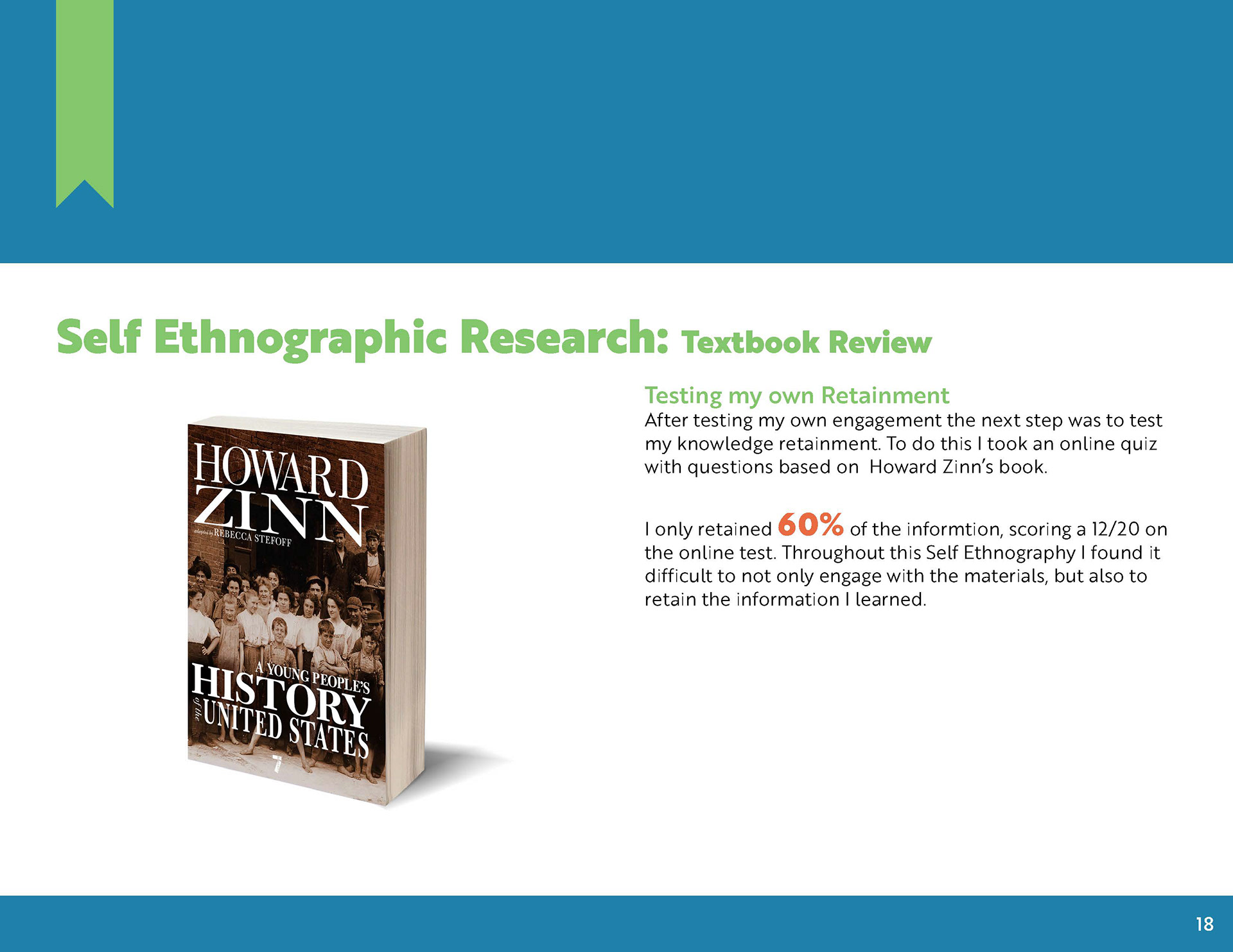
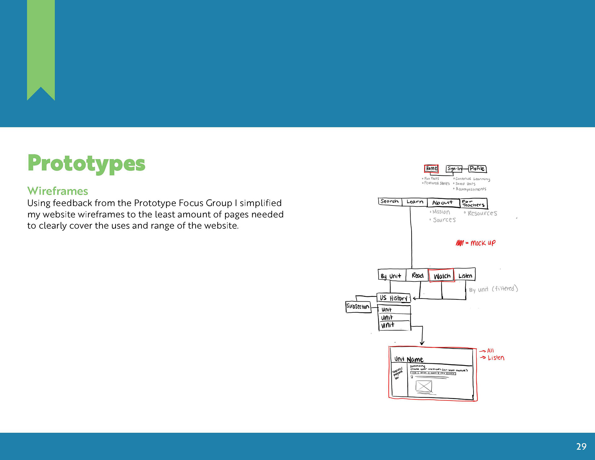
Before I began any design work for Cleio I started by doing 10 weeks of research on the topic. Below is my final research document which encapsulates Cleio's what and why. The document contains examples of the research I conducted and the early prototypes, sketches and brand direction of Cleio.