HARPERCOLLINS PUBLISHING
REBRAND|BRAND ING|LOGO
OVERVIEW
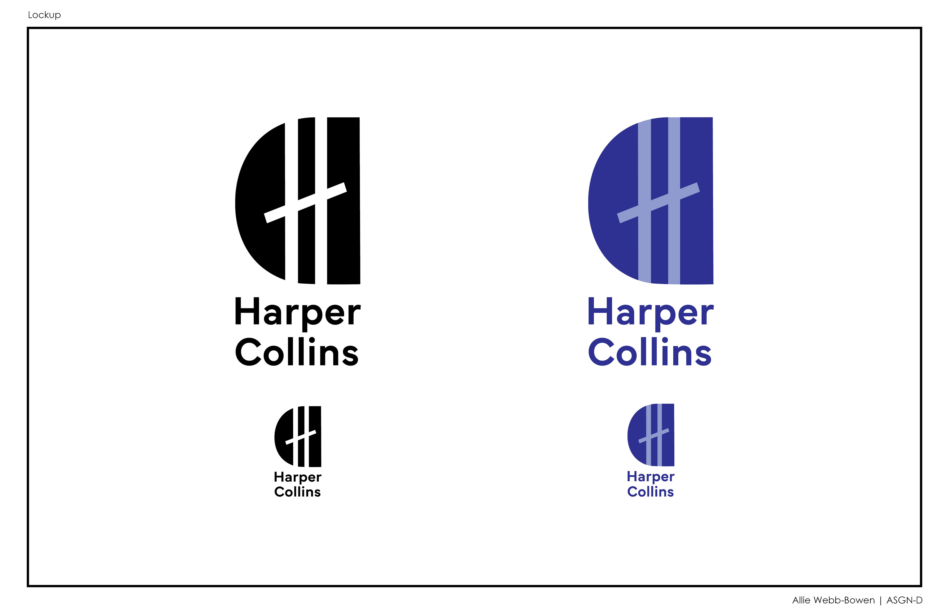
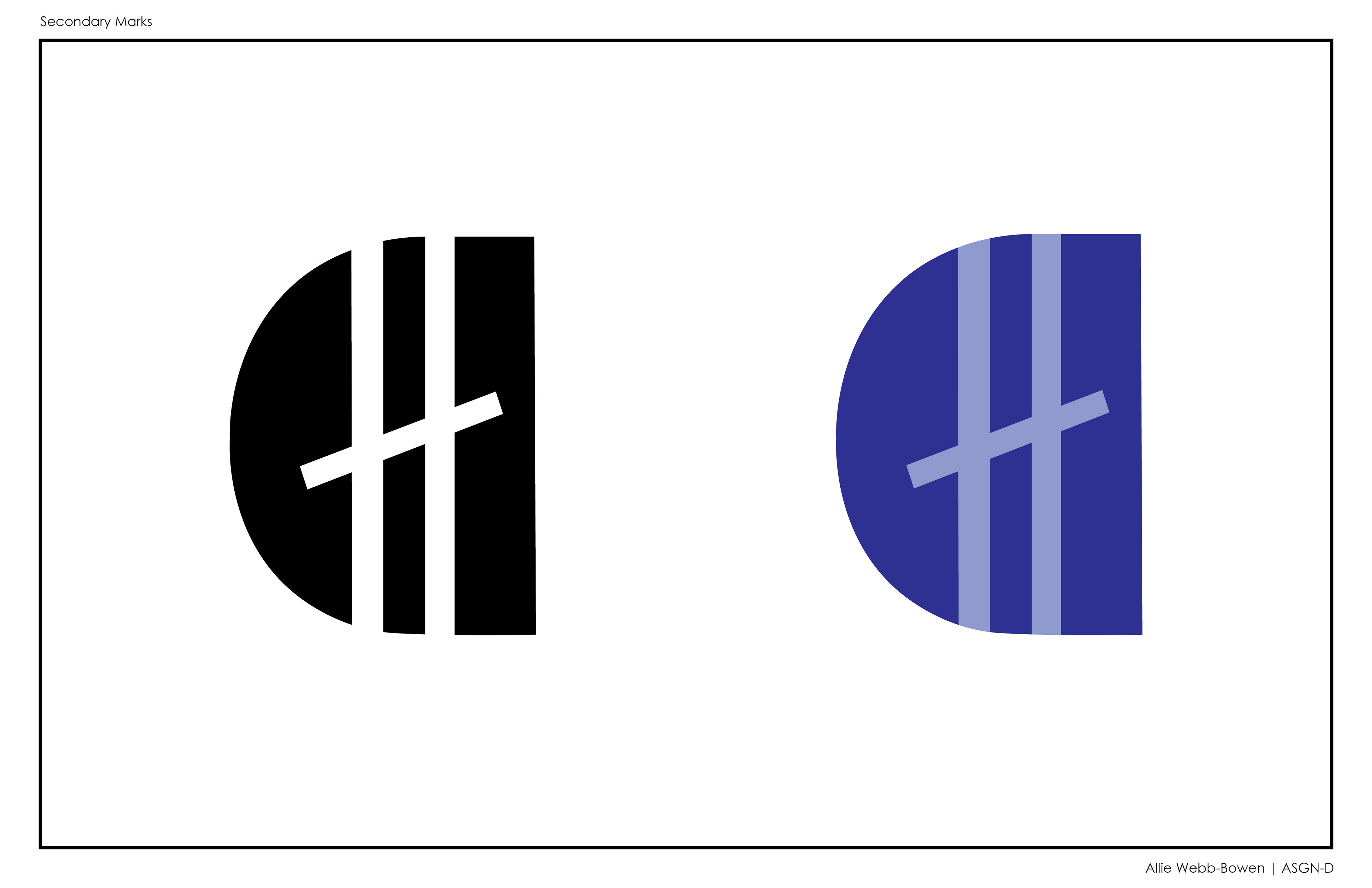
For this project I rebranded HarperCollins Publishing. I took inspiration from their current logo which represents two publishing agencies coming together to form one. The same idea is found in my rebrand, with a connection formed between the publishing companies home cities (New York & Glasgow) rather than the fire and water featured in their current logo. I then created a new brand identity system and displayed how it could be utilized within their marketing and physical materials, as seen above.
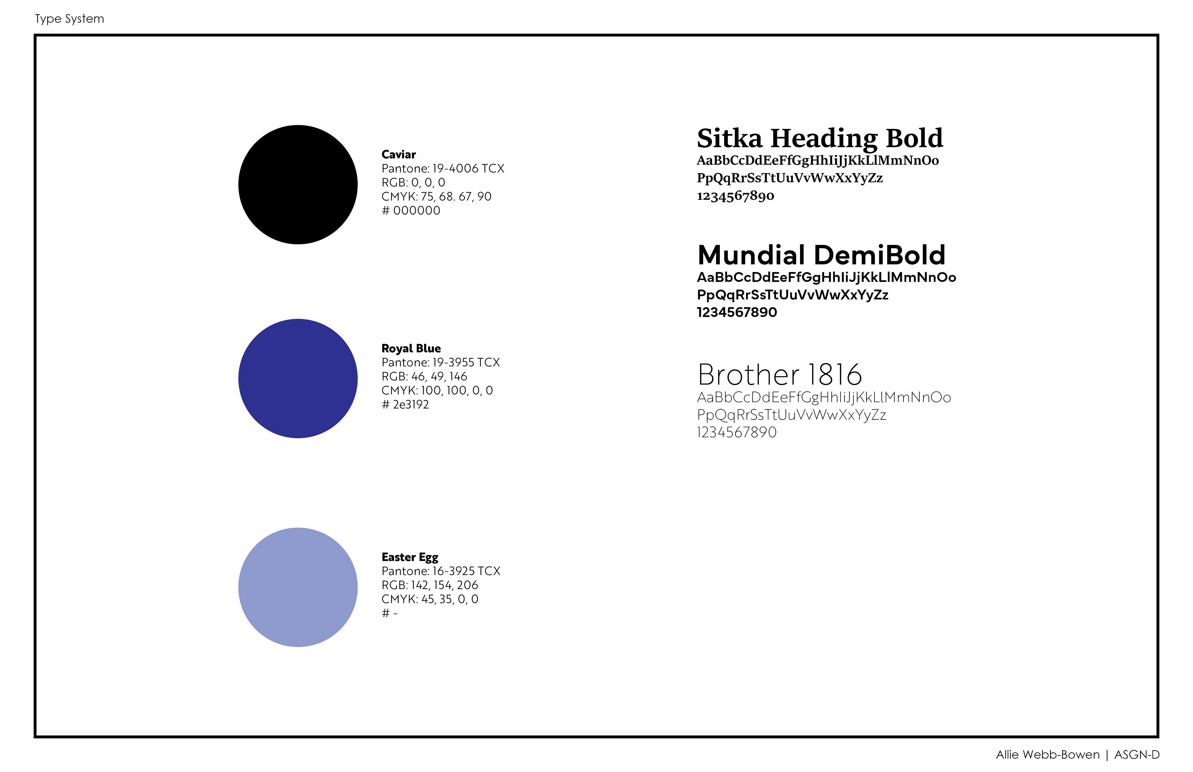
Programs Utilized: Adobe Illustrator, InDesign & Photoshop
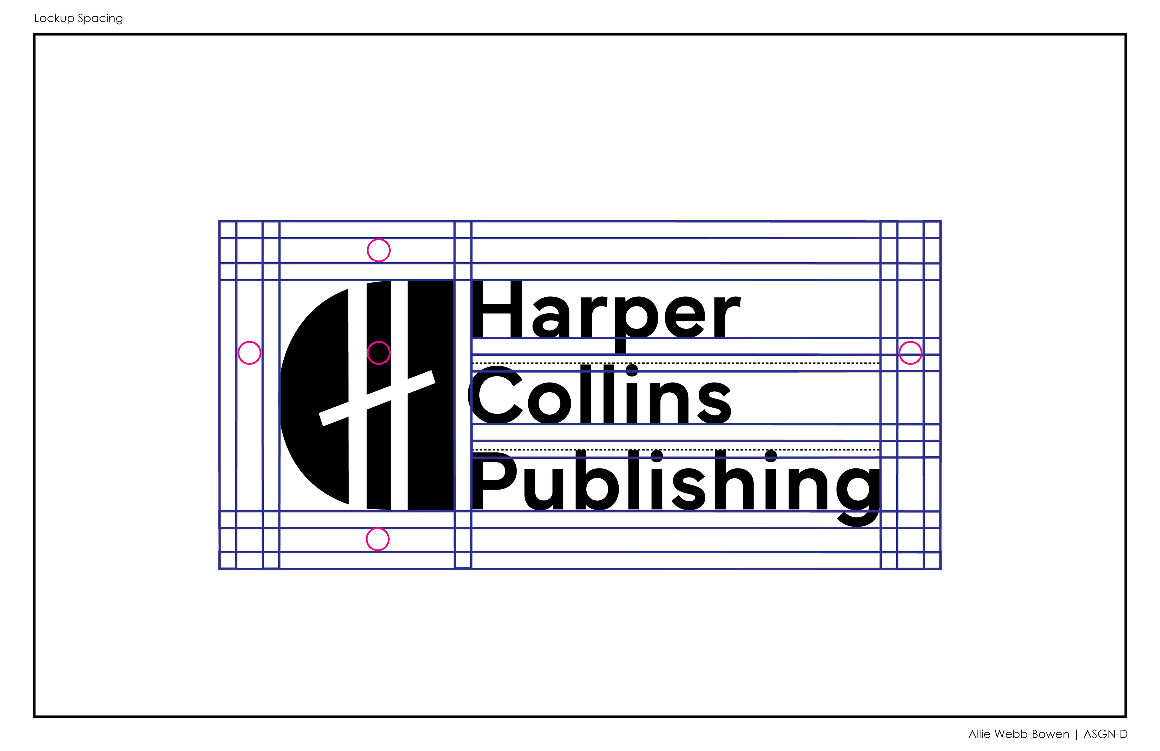
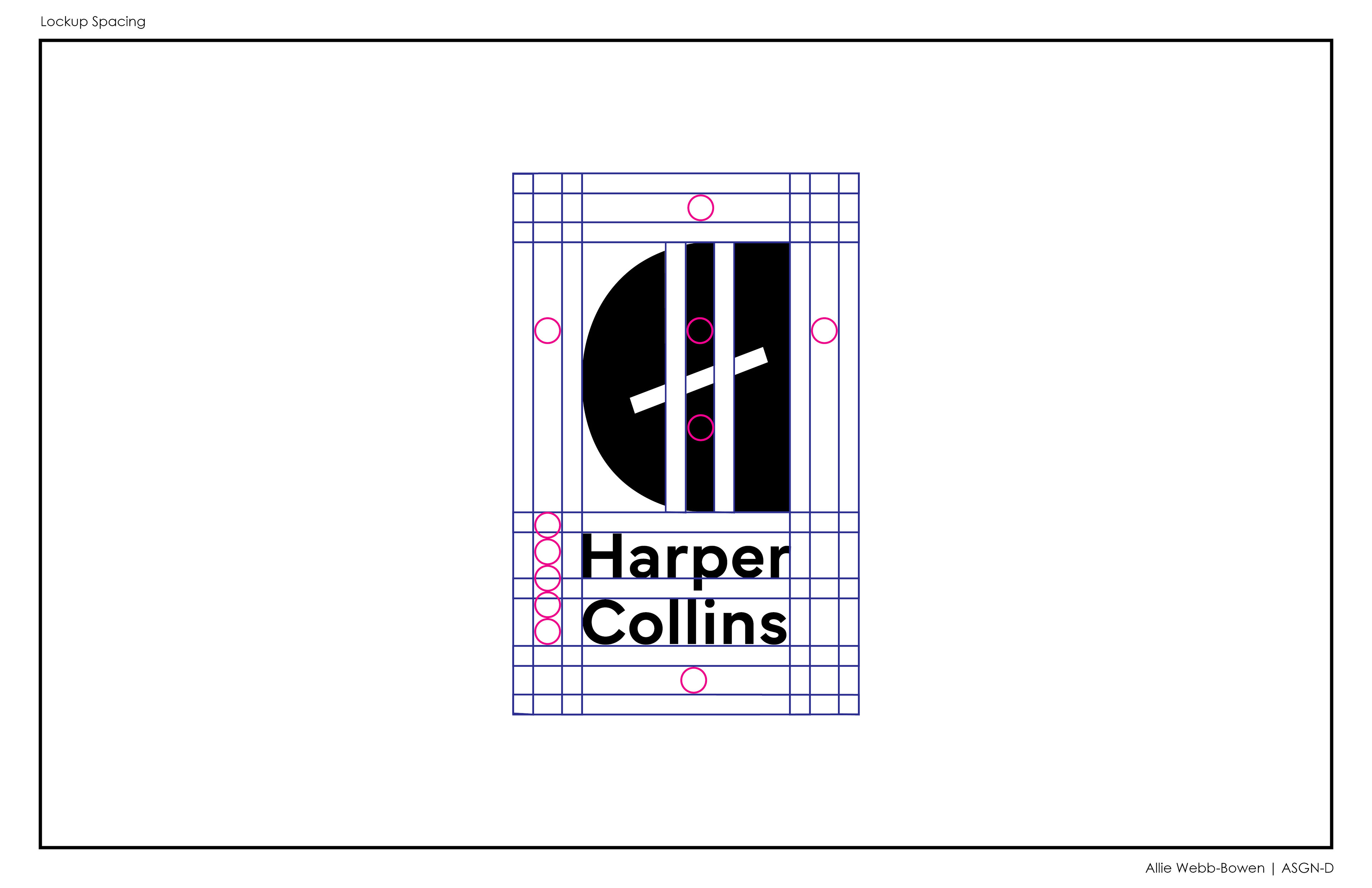
DELIVERABLES
The final deliverables of this rebrand included a logo and branding system. Below is the final logo created for this project. The shapes and angles which create the 'H' within the 'C' are a reference to the Clyde Arc bridge in Glasgow, and the Brooklyn Bridge in New York. Glasgow and New York being the two founding cities of the company. The blue colors utilized in this rebrand were chosen due to the colors ability to support learning.
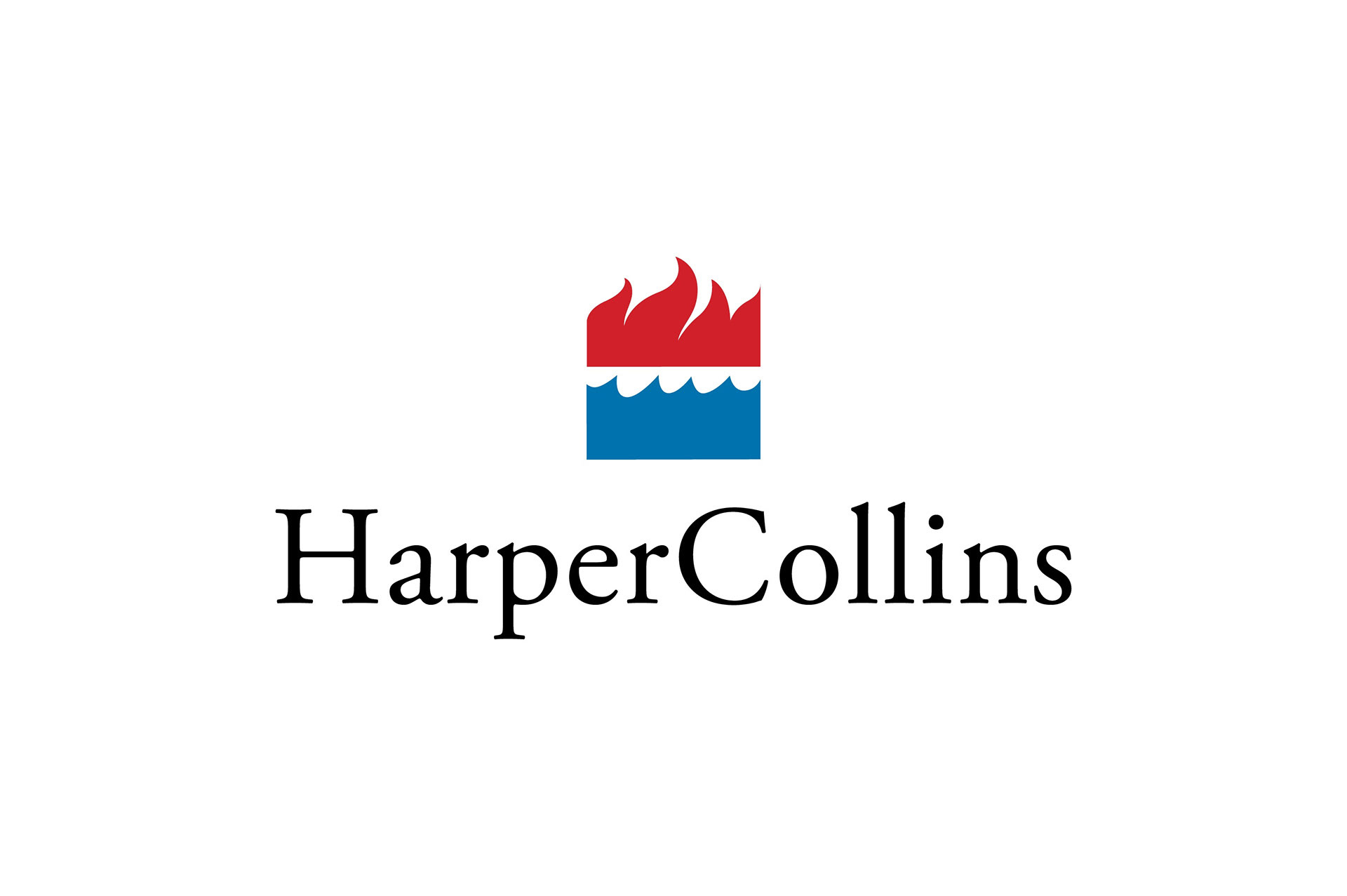
Original HarperCollins Logo
To the right is the original HarperCollins Publishing Logo which I chose to rebrand for this project. It depictss fire and water, as each was an element of the two publishing agencies logos. When they came together they were combined.
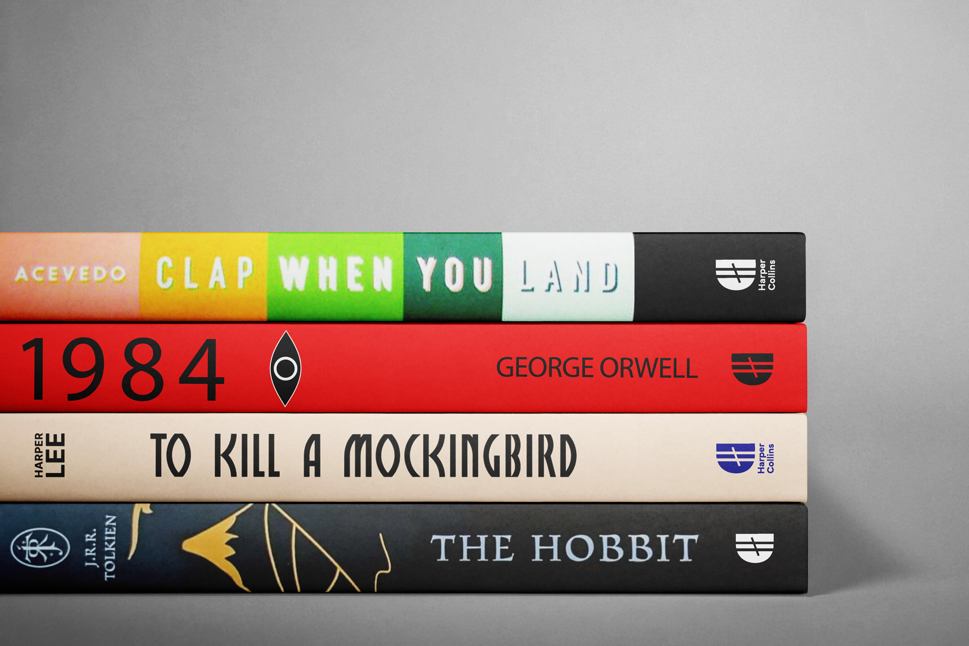
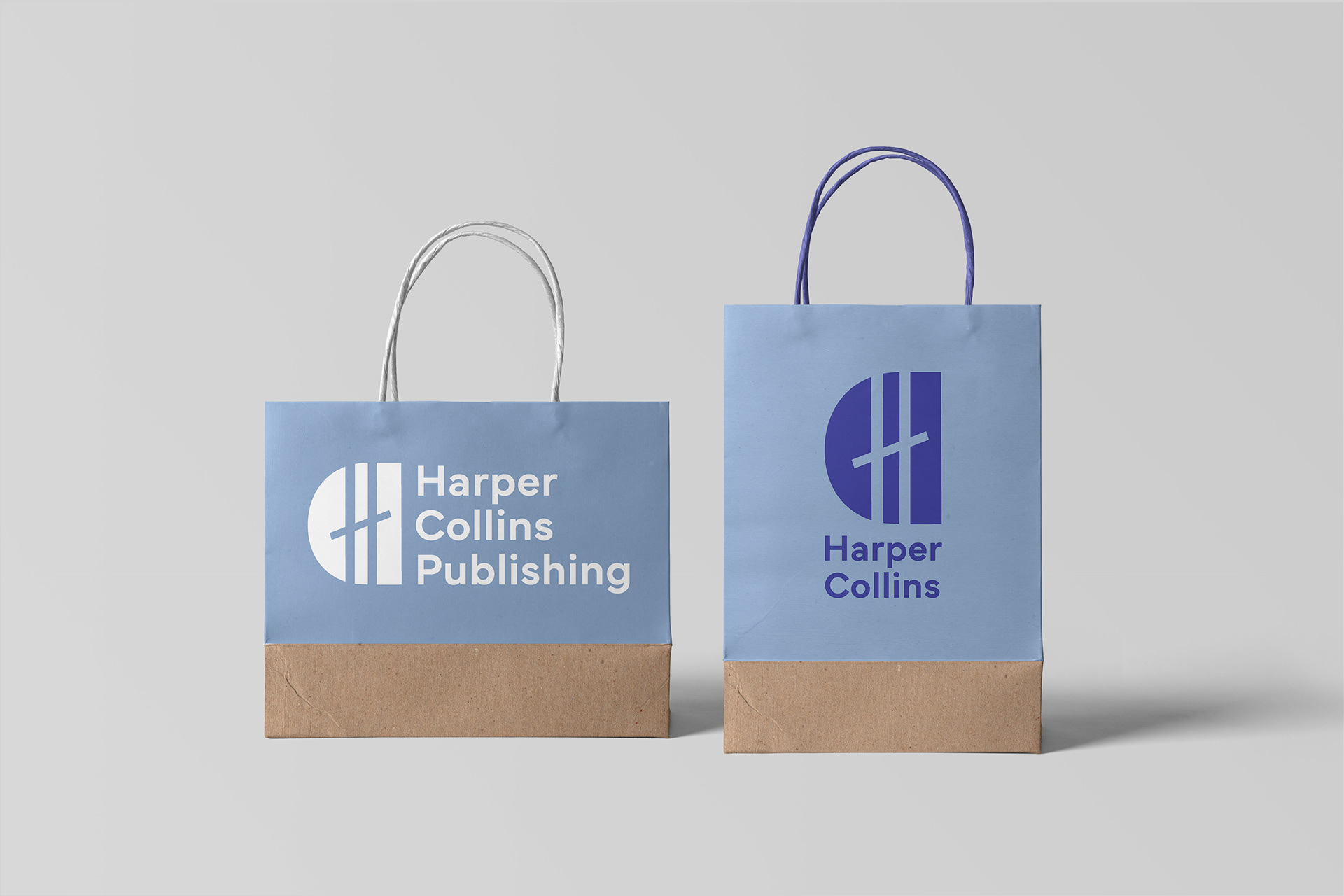
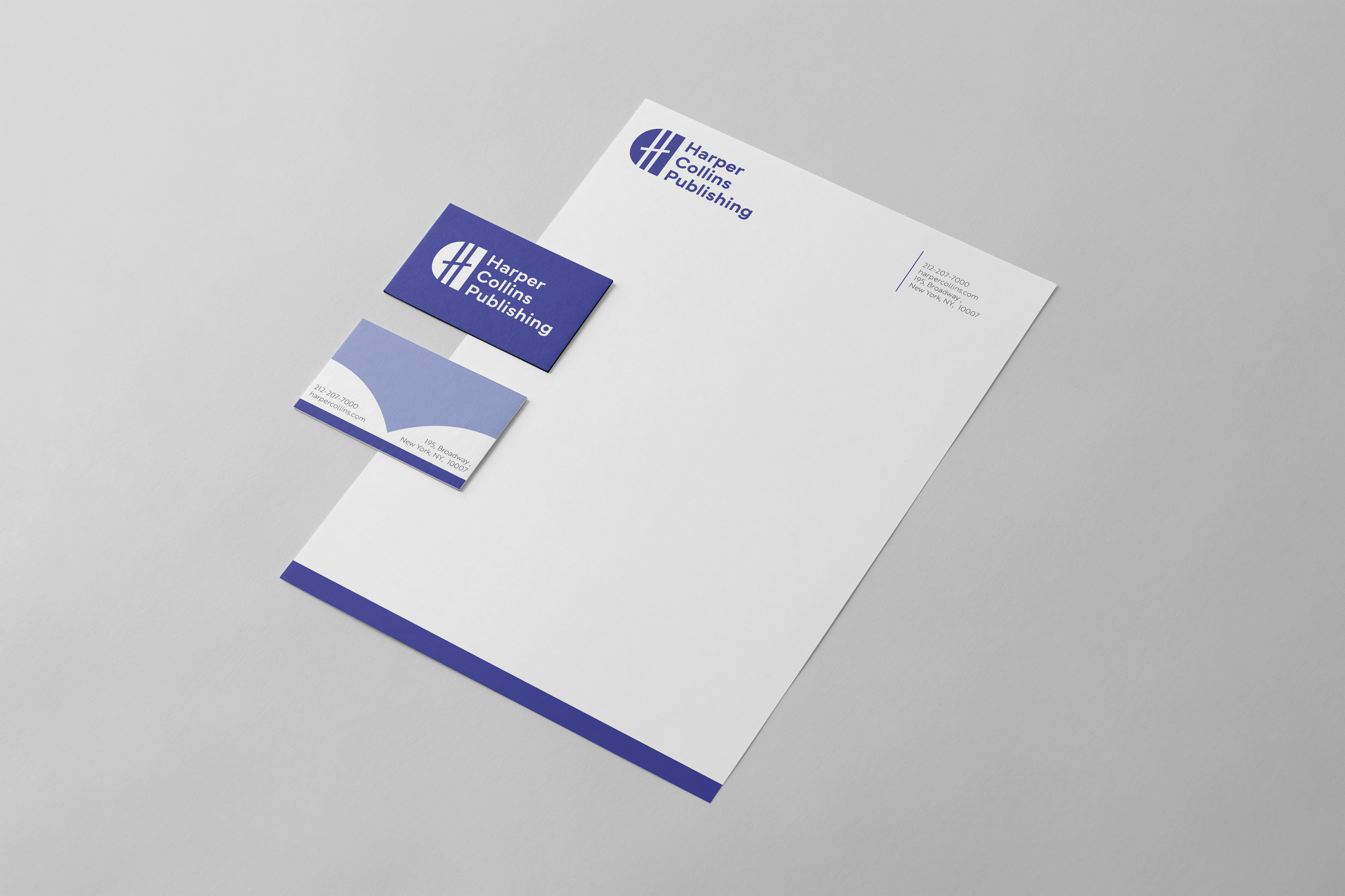
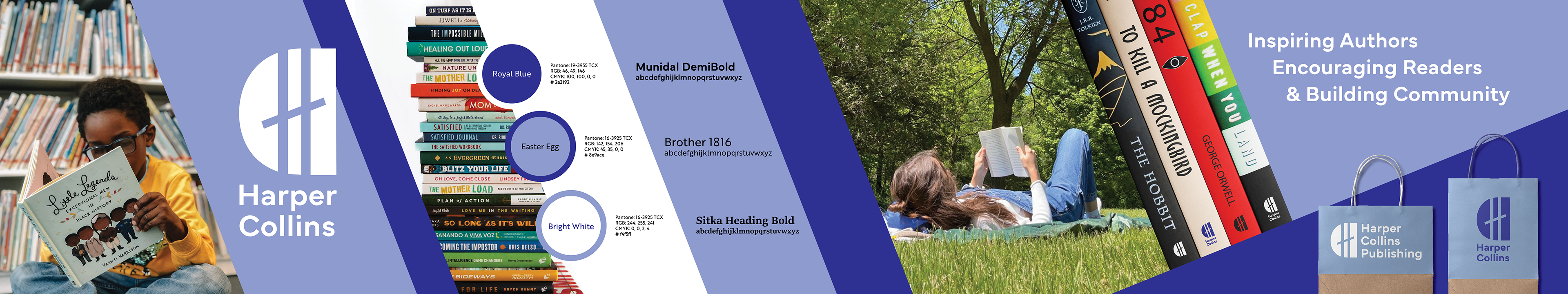
MOCKUPS Other final deliverables included mockups of brand applications. I choose to mock up the logo on the book spines of banned books, as HarperCollins Publishing puts an emphasis on the importance of reading banned books. Other branded materials include paper bags for shopping, and stationary. I also created a 'stylescape' to capture all elements of the rebrand in a single image.
PROCESS
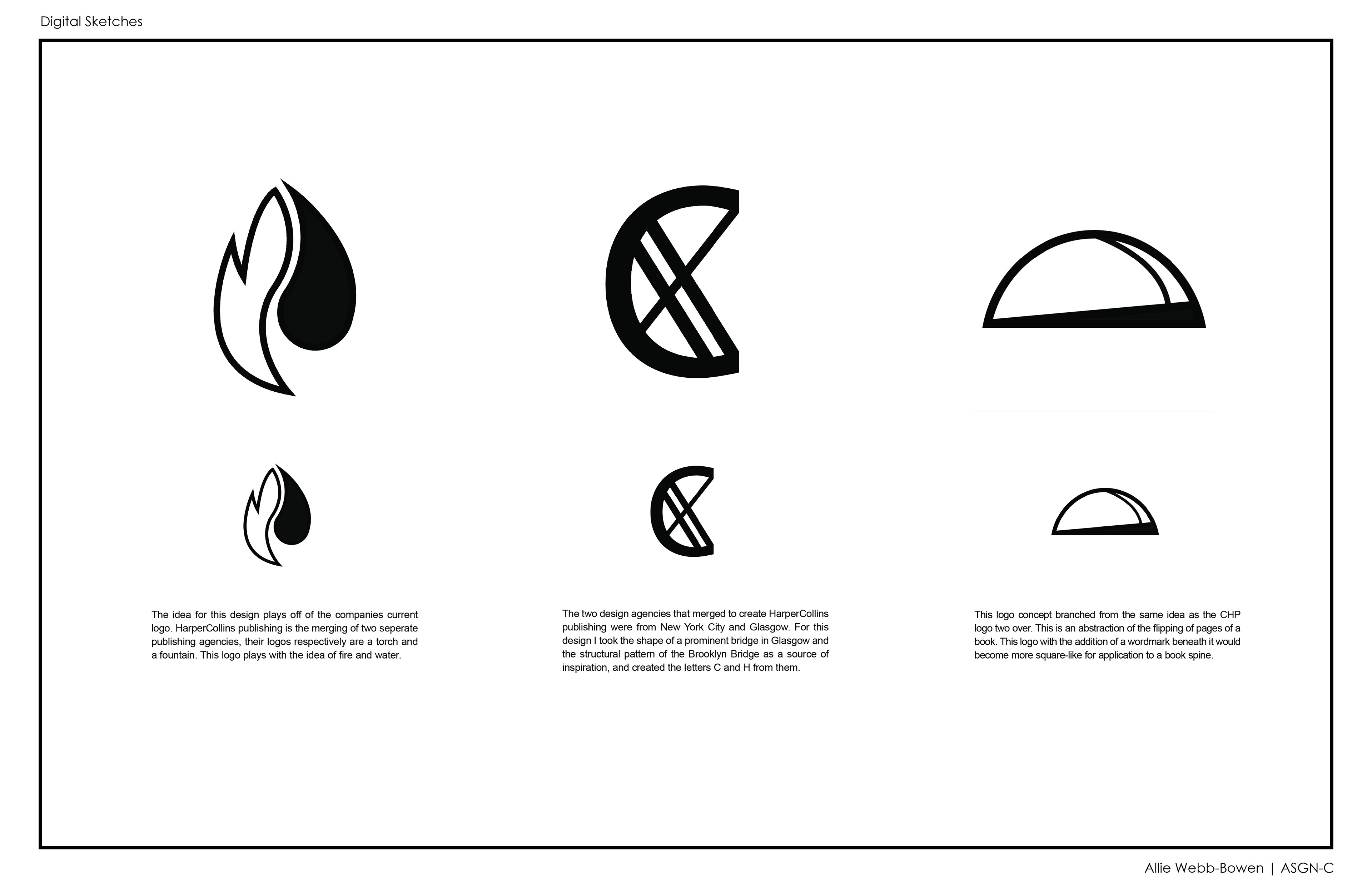
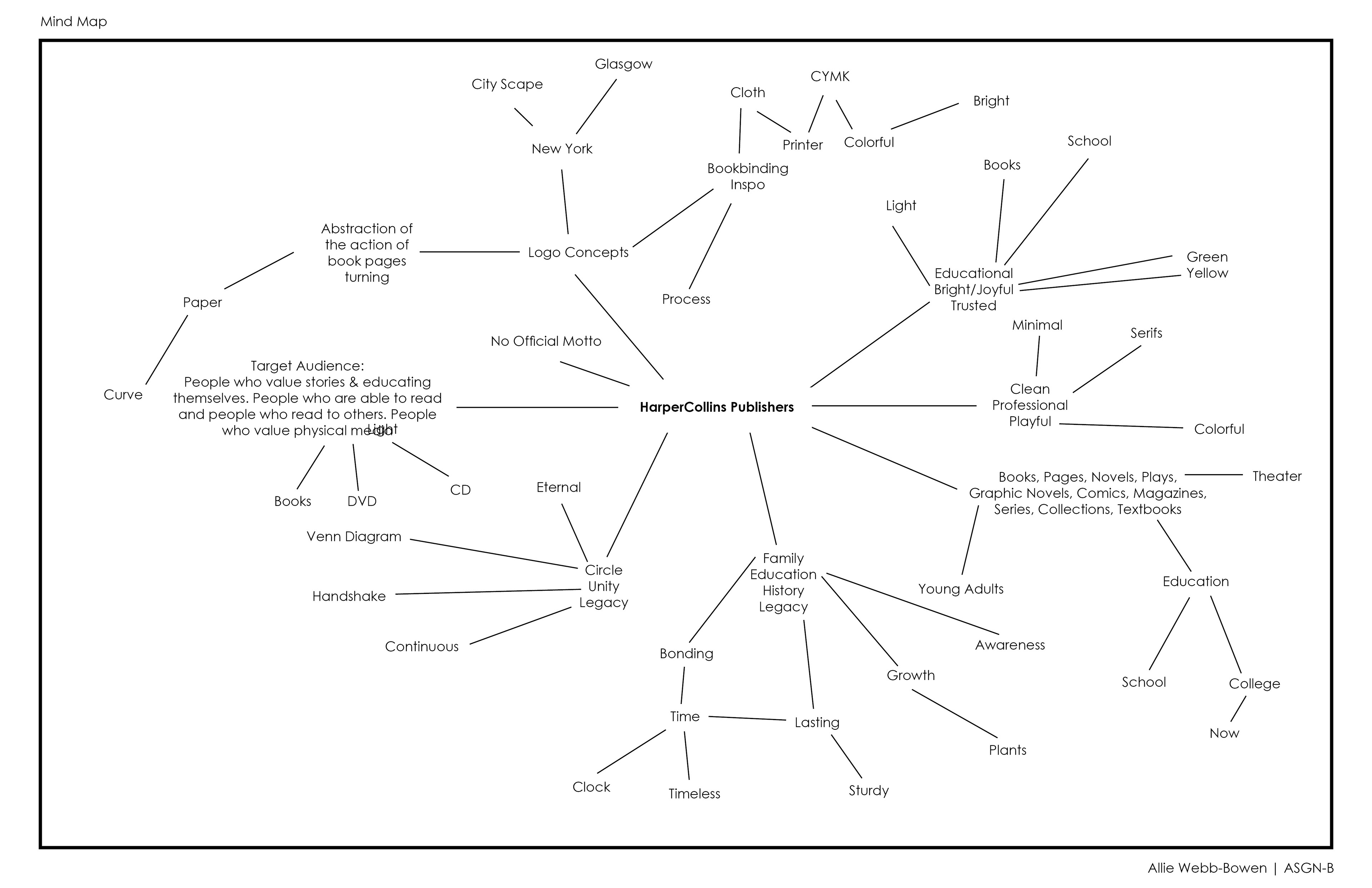
LOGO & BRAND DIRECTION To begin this process I worked to better understand the brand. I explored the brand via mind map and determined pathways for logo and aesthetic pathways that could be pursued. Inspiration from books, fire & water (their original logo), book binding, and the two cities the publishing agencies were founded in are all pathwats pursued in the process stages of this project.

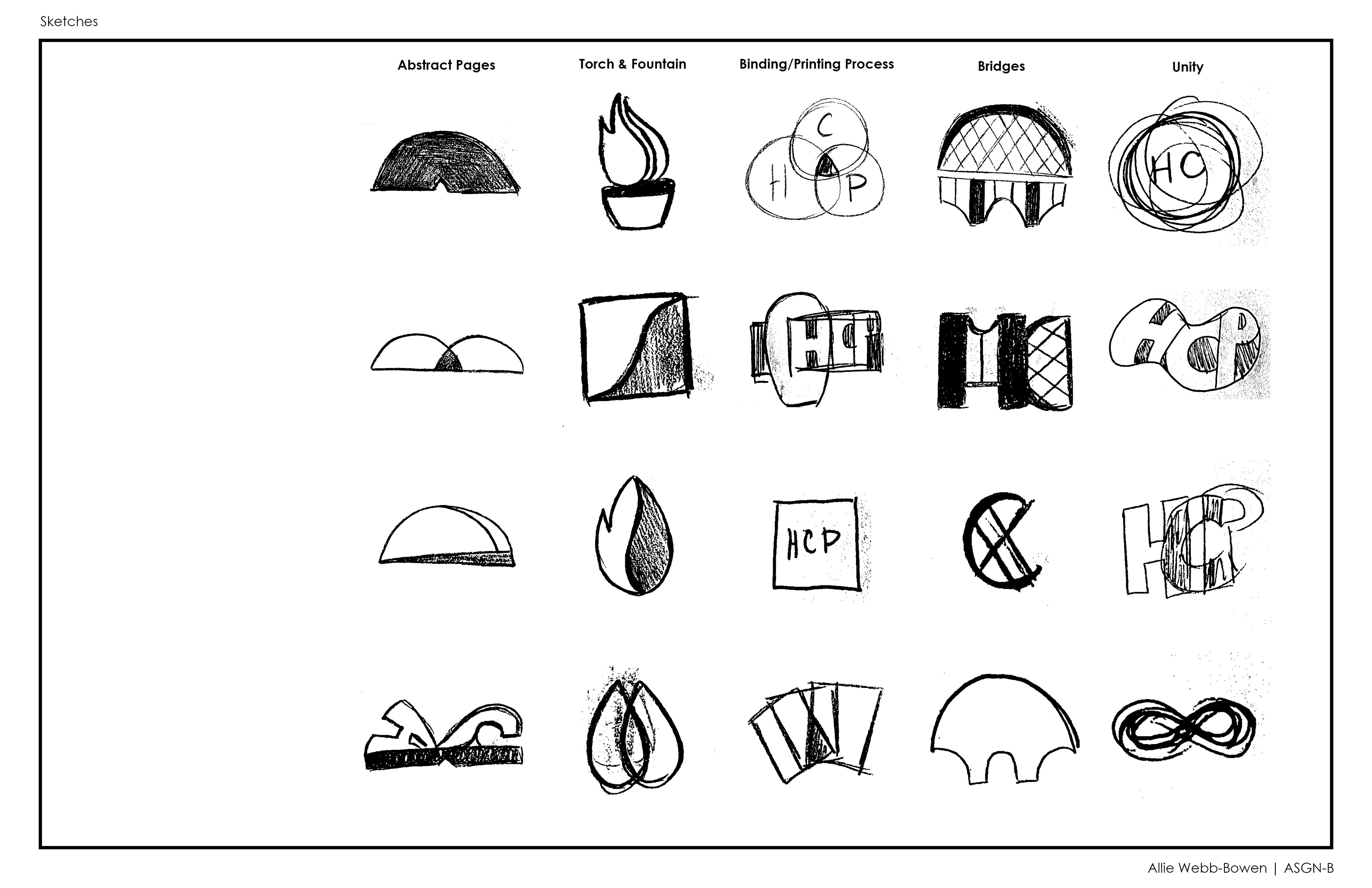
LOGO DEVELOPMENT After coming to a better understanding of the brand I chose to further develop the strongest concepts. The first being the fire and water logo, a direct reference to their current logo. The second a combination of architectural forms from the publication companies two founding cities, and the final an abstracted book. From here I chose the middle design to further explore as I created the final branding system.